We know silver has underperformed gold significantly since 2011 which is a bullish sign because when investors favor gold over silver it means that they are more interested in safety than speculative gain so it is a sign of the sort of pessimism that classically accompanies market bottoms.
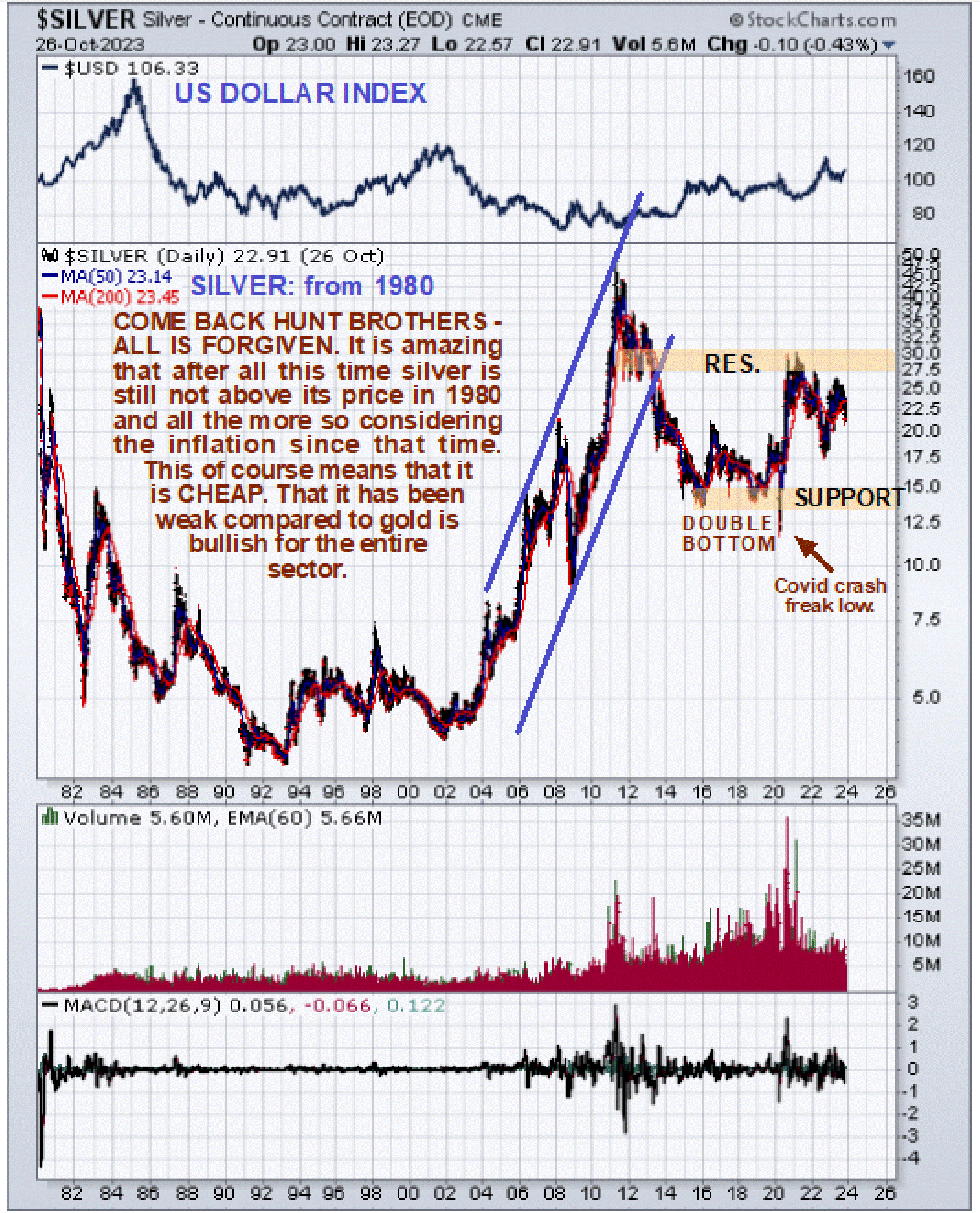
Looking at the long-term chart for silver going way back to 1980 it is remarkable to observe that it is still below the level it was at in 1980 and this is in nominal terms.
If we factor inflation in during all the intervening years it is obvious that silver is now very cheap in real terms. On this chart, we can also define the broad uptrend of the 2000’s that paralleled gold’s uptrend and we can also see how, disregarding the “head fake” freak Covid crash drop in the Spring of 2020, it then broke out of a large Double Bottom to complete the 1st upleg of the major new bull market before pausing ever since to consolidate.
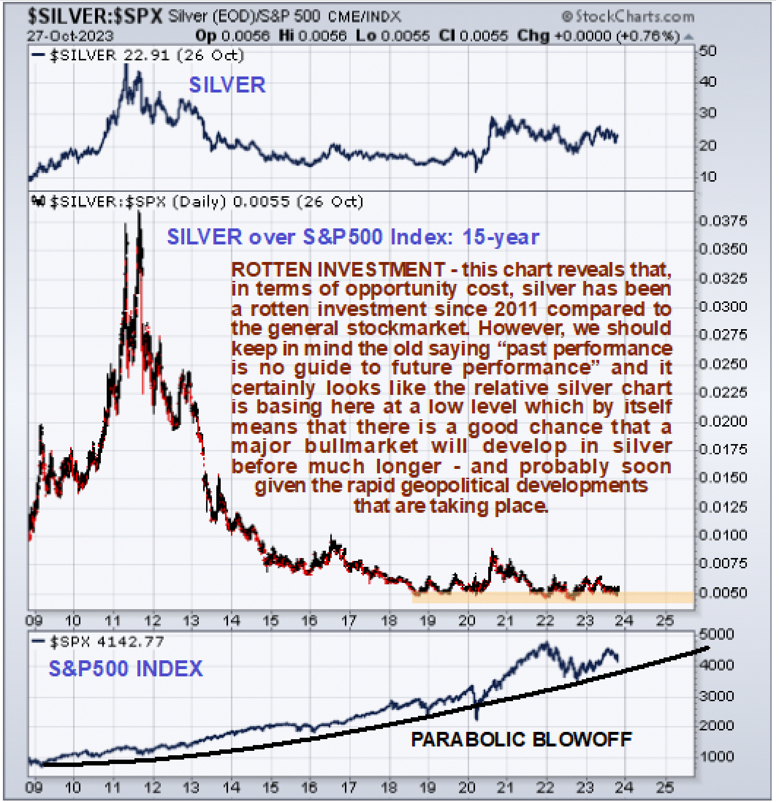
On the 15-year chart for silver relative to the stock market (S&P500 index) we can see that silver has been a rotten investment compared to stocks since its 2011 peak with silver having been in a bear market until 2020 and the ratio having stayed in a bear market until now. That said, however, it certainly looks like the ratio is basing at a low level here.
This is the sort of chart that would impel any true contrarían investor to switch out of the stock market and into silver. The S&P500 index, shown at the bottom of this chart, looks like it is close to breaking down following a long parabolic blowoff move, and if it does it could crash. However, on this occasion, it doesn’t now look likely that gold and silver will be taken down with it.
This is because a stock market crash will be accompanied by, and perhaps preceded by, a meltdown in the debt market so that Treasuries offer no safe haven as in the past, which is perhaps not so surprising given that the US government is demonstrably bankrupt and running on fumes emanating from the Fed.
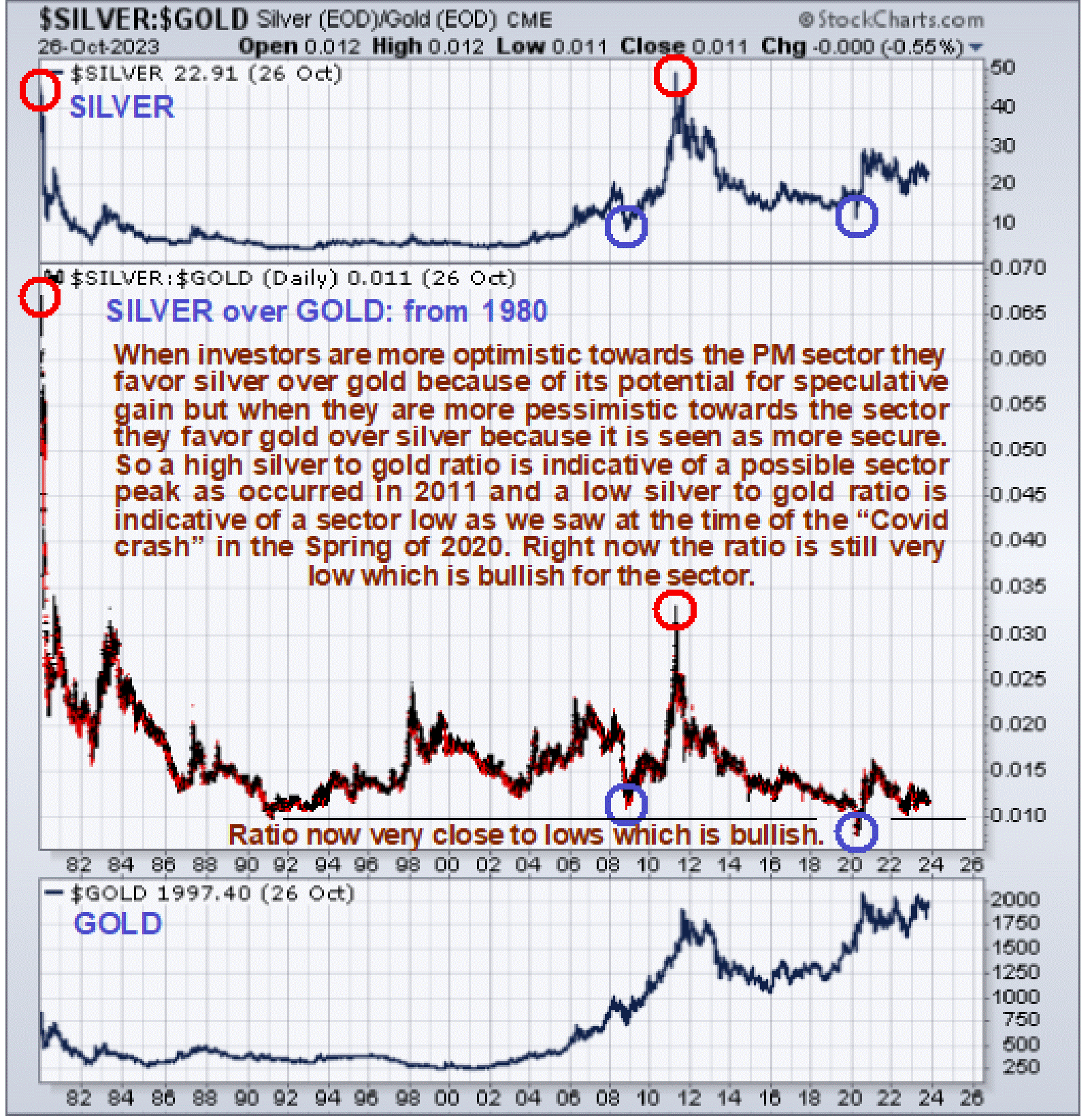
We will end with a ratio chart that is viewed as providing compelling evidence that the Precious Metals sector is grossly undervalued with much more upside potential than downside potential and that is the long-term silver over gold ratio chart.
This chart is very easy to interpret and use. As a general rule, when the ratio is at a high level it means that there is strong speculative interest in the sector which is a sign of a top and we certainly saw that in 1980 when the ratio was at a wild extreme and again in 2011 to a lesser extent.
When the ratio is at a low level it means that speculative interest is at a low level which is a sign of a bottom and this we saw in 2003 before the 2000s sector bull market really got underway and again in 2008 following the steep drop induced by the broad 2008 market crash and then briefly at the time of the Covid crash in the Spring of 2020 when for a brief while you literally couldn’t give oil away.
Note that, as mentioned above, a stock market crash is not expected to cause Precious Metals to drop hard as in 2008 apart from perhaps a short-lived knee-jerk reaction, because this time the debt market looks set to drop hard too, and it will probably be a debt market meltdown that triggers a stock market crash.
The conclusion therefore is that the outlook could scarcely be better for the Precious Metals sector.
About the author