Since there is so much information to show you on Silver, Gold and the GDX I’m going to break it down into 3 parts so you can better understand what the charts are strongly suggesting.
Silver Part 1:
After an eight month correction in the PM complex I’m going on record to say the bottom is in. I know it is a bold statement but everything I see from a Chartology perspective is strongly suggesting the new impulse move up has begun. I don’t make these kinds of predictions often because of the impact it can have on ones portfolio if I’m wrong.
I’ve been cautiously optimistic since the middle of April 2021 when we began the accumulation process of putting together the PM Stock Trades Portfolio. You never know for certain when you put on a big trade like this if you are making the right decision or not. It is only when you look back in hindsight that you know for certain that what you were seeing is actually correct.
The more time that passes without getting stopped out of your trades the more confident one can get. Usually if your low risk entry point fails to hold support you get stopped out of your trade and you go back to the drawing board. On the other hand the longer the trade can stay solvent that means nothing is broken in regards to your original thesis. The stock has either traded sideways or has moved higher leaving your original sell/stop still in place which is the key to a successful trade, not getting stopped out on the front end.
I mentioned a week or two ago that when this correction was over that we would see a change of character which will be pretty evident. Instead of seeing chopping action going nowhere fast, big up days followed by big down days during the consolidation phase, the stock will start to move up in a more pronounced way with bigger up days followed by smaller down days.
Some of you may remember when the correction began in August of 2020 I said the easy part was over, the impulse move from the March 2020 low to the August 2020 high, and now the hard part begins. The PM complex just experienced an 8 month correction that did its job of putting doubt in investors minds as to the validity of the bull market. Also the type of consolidation pattern many of the PM stock indexes and PM stocks built, a bullish expanding falling wedge, is one of that harder consolidation patterns to recognize early on in real time as the stock keeps making lower lows and lower highs. On the positive side when you do spot a bullish expanding falling wedge that is generally a very bullish pattern. The reason being, as each successive lower low stops out more investors there comes a point when there are no bears left and only buyers. Knowing that you are in a bull market the odds are extremely high the bulls will win the battles and eventually the war.
Lets start this in-depth look at the PM complex by looking at Silver as it has held up the best and is likely to lead this next impulse move higher. We’ll start with the short term daily charts and work our way out to the long term charts for perspective. This first chart is a 7 month daily look at SLV which shows a nice H&S bottom in place with the price action making higher highs and higher lows which is the first thing you have to see in order to form an uptrend. At a minimum the price objective for that small H&S bottom is up to the top of the trading range around the 27.65 area.
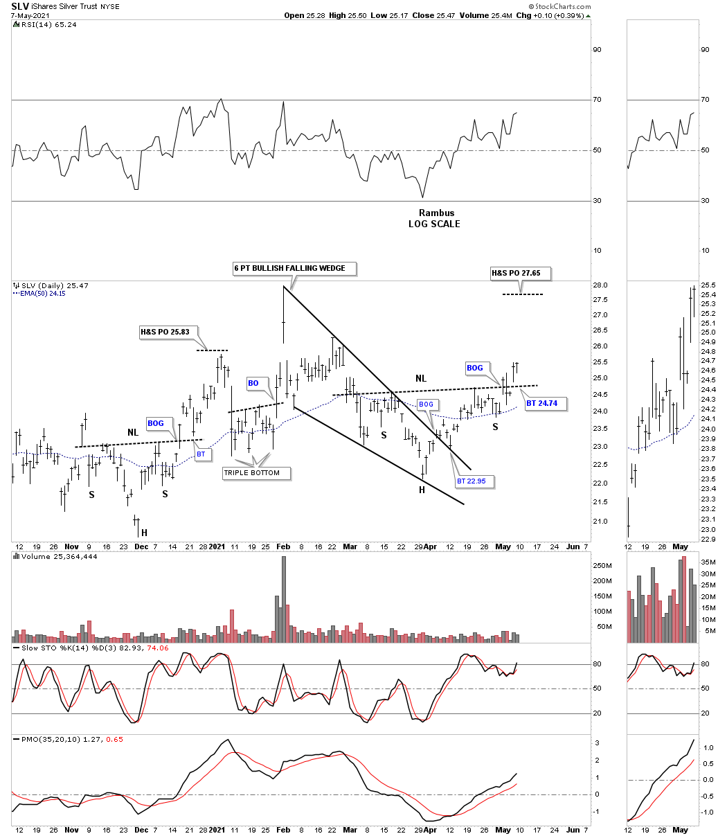
When a stock is building out a large consolidation pattern most of the time you will see a smaller reversal pattern form at the reversal points. Here you can see the H&S bottom on the chart above has formed at the 4th reversal point which again suggests a minimum move up to the top rail of the August 2020 triangle. At that point we will most likely see some hesitation and a small selloff even if the breakout is going to happen. What that hesitation tells us is how many bears are left to defend the top rail. If the breakout is going to happen then the next rally phase will slice through that top rail like a hot knife through butter as the bears retreat to higher ground with the bulls in full control. See March 2020 H&S bottom.
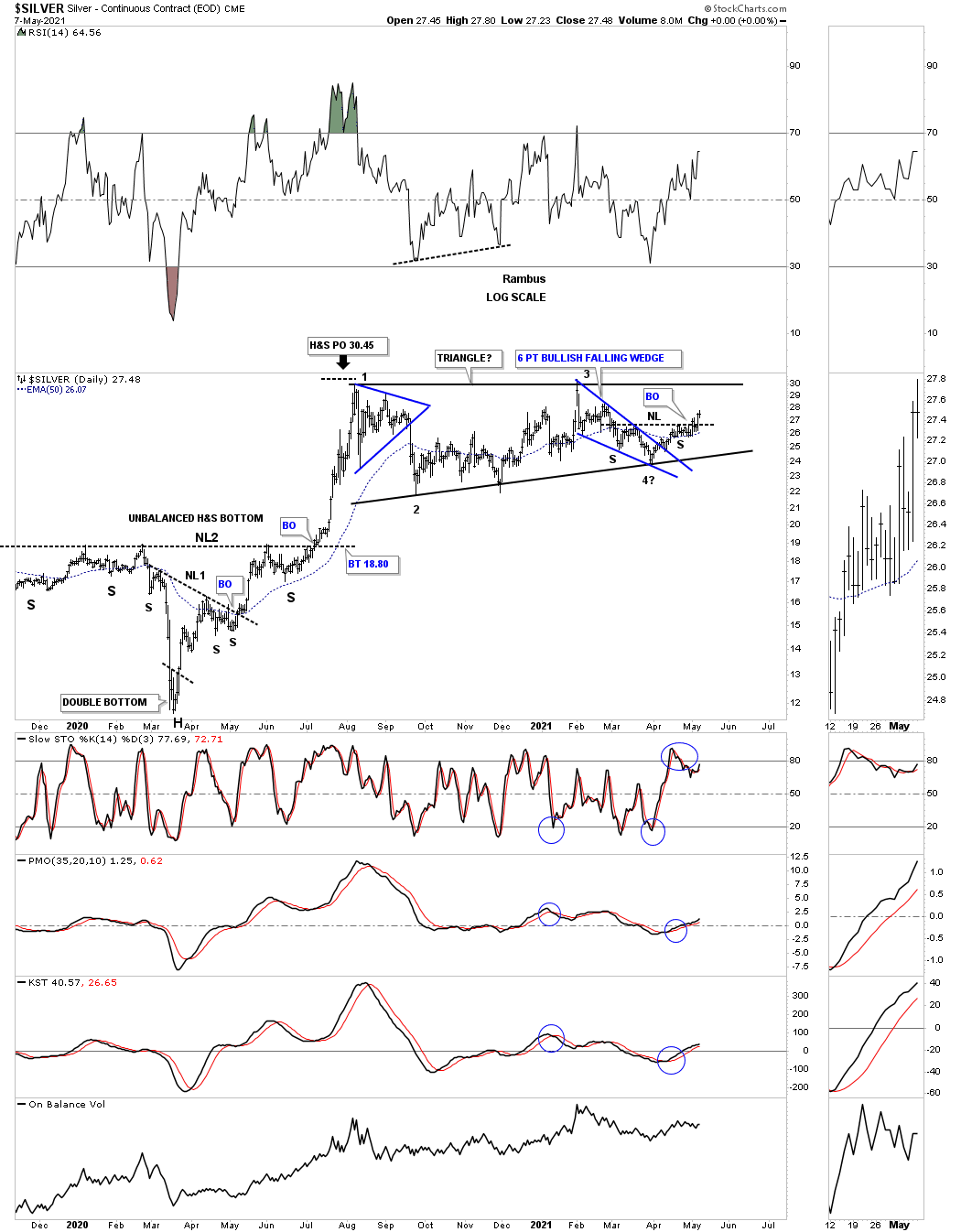
Many Chartist don’t like to use line charts but I find them very useful as they can sometimes give a quicker heads up to when the breakout may occur. Below is a weekly line chart for Silver which shows the August triangle with a potential tiny breakout last week.
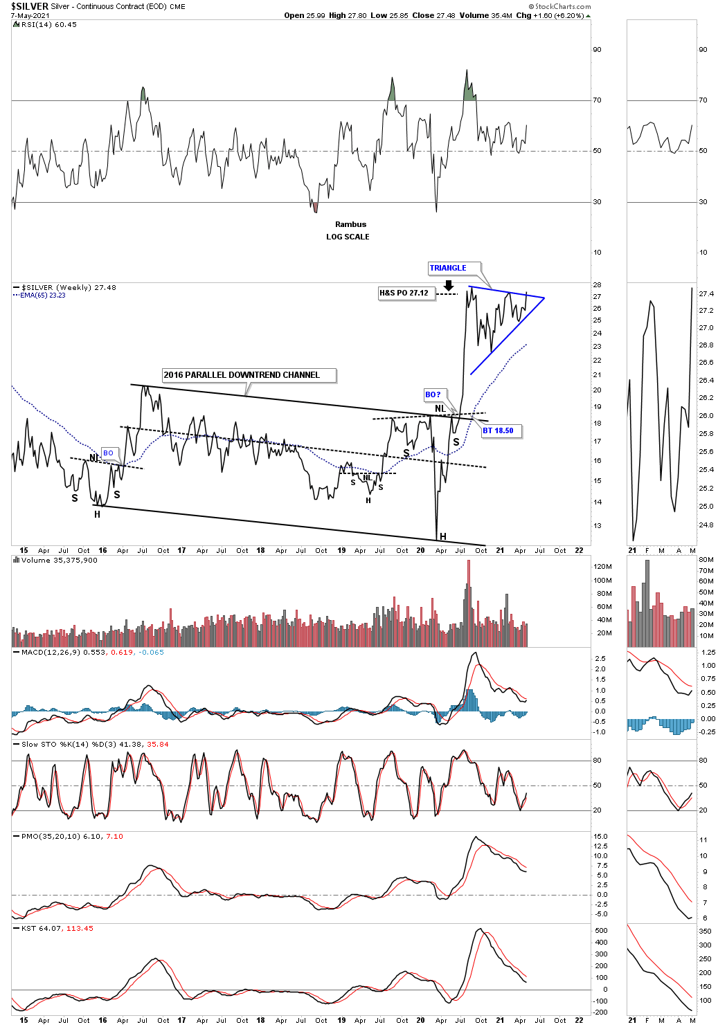
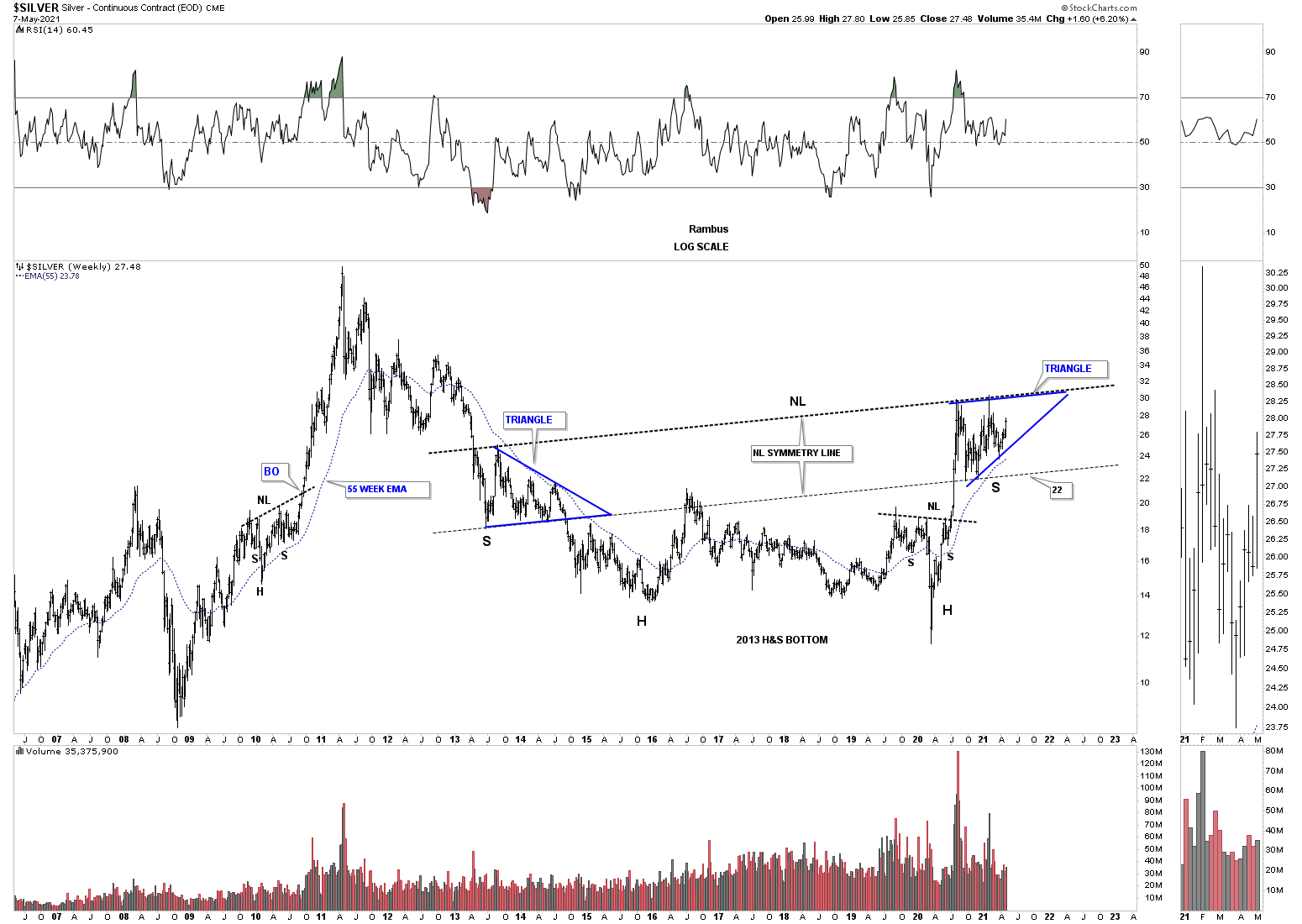
Here is where things start to get very interesting for Silver. As you can see Silver has been forming a massive H&S bottom since 2013. The triangle on the weekly line chart above is the same triangle that is forming the right shoulder. That massive H&S base is about as symmetrical as its gets as shown by the neckline symmetry line which shows the low for the right shoulder.
Below is the exact same chart as the one above but this is a bar chart which shows the neckline much higher than the line chart. It will be interesting to see if the line chart shows the breakout before the bar chart which in many cases it does.
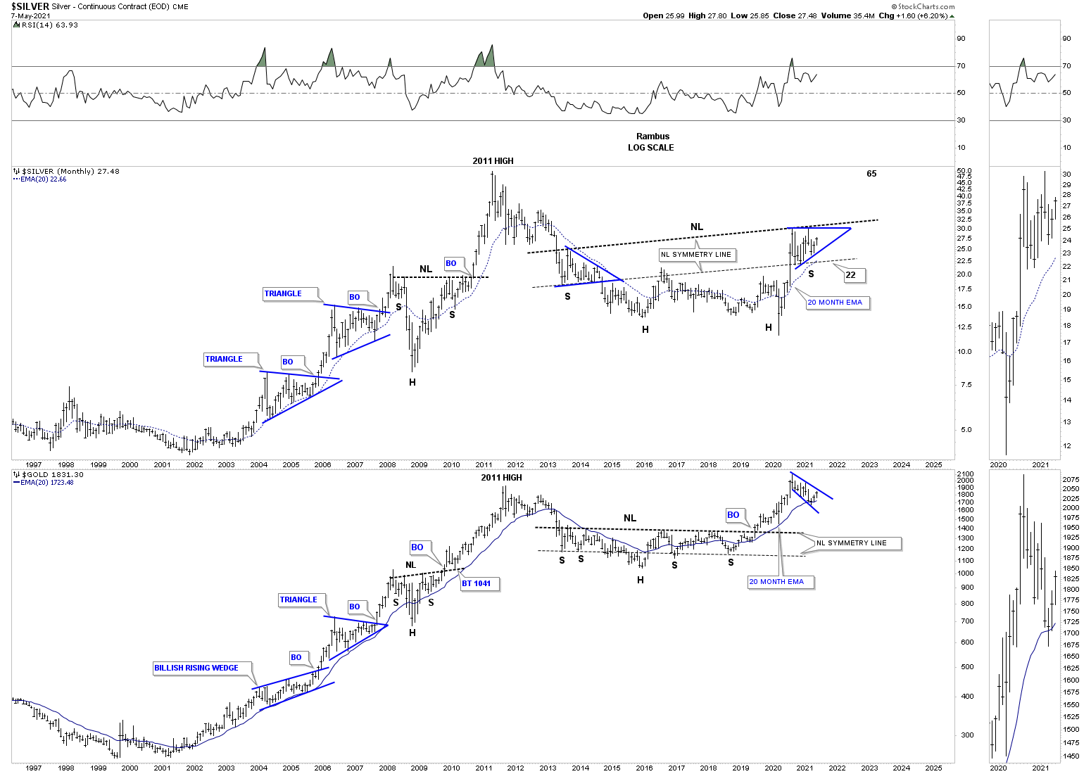
Lets put that 2013 massive H&S base in perspective by looking at the very long term monthly chart. As you know Gold was the leader during the first leg out of the 2016 bear market low. You can see this very clearly on this combo chart which has Silver on top with Gold on the bottom. Note where the breakout above the neckline on Gold took place vs Silver which still hasn’t broken out above its neckline yet.
Note how similar these two generally move together. It is never a perfect correlation as one may lead for awhile but you can see how similar their respective bull markets looked from 2000 to 2011 where Silver actually topped out first in April while Gold didn’t put in its bull market high until September of 2011.
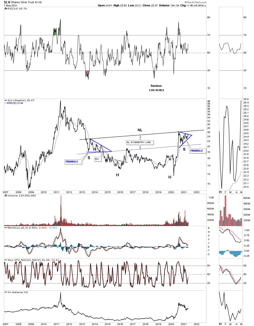
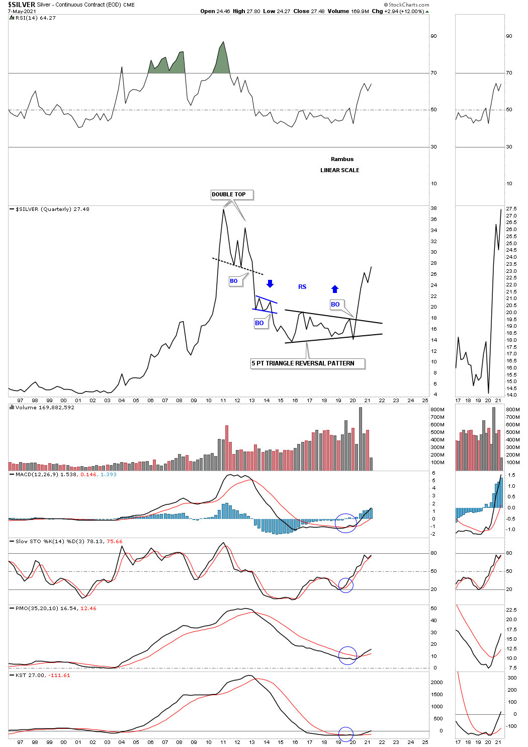
This last chart for Silver is the long term quarterly line chart that tells the big story for Silver. Remember a stock only does one of 3 things. It can build out a reversal pattern, consolidation pattern or is in an impulse move. If you failed to catch the top in 2011 you could have gotten out of Silver when the double top was completed. Again, if you didn’t catch the bottom and are a long term investor you could have gotten back in when Silver closed the quarter above the top rail of the 5 point triangle reversal pattern. Note the small blue bearish falling wedge which formed about halfway down in the bear market after the breakout from the double top trendline.
I will have Part 2 on Gold tomorrow. I would like to wish all the mothers a Happy Mothers day and all the best…Rambus
About the author