The gold/silver ratio appears to be in free fall. There is a fractal setup on the chart similar to the 2010/2011 silver rally:
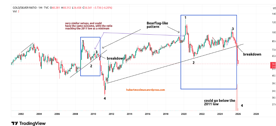 I have marked the two fractals (1 to 3) to show how the current collapse of the gold/silver ratio could play out. If this similarity continues, then we could see the gold/silver ratio go below the 2011 low. This would likely mean considerably higher silver and gold prices.
An interesting point about this similarity to 2010/2011 is illustrated in this chart below:
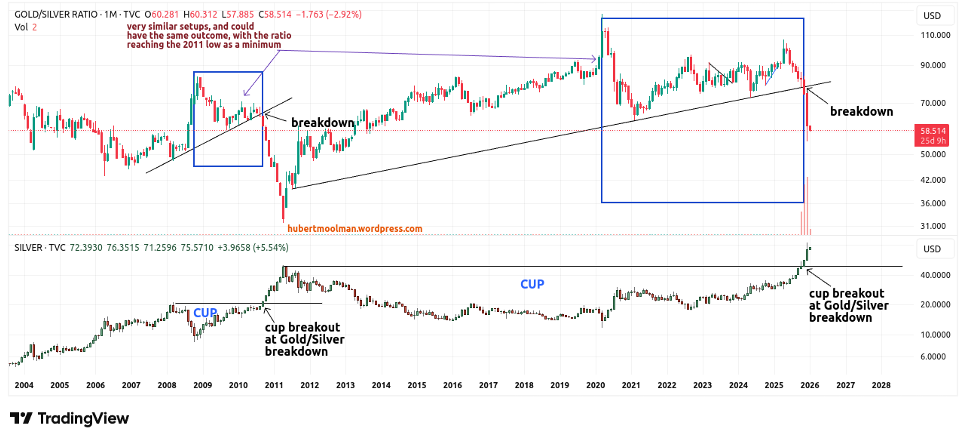 It is a comparison of the gold/silver ratio chart (top) and the silver chart (bottom). Around the same time when the gold/silver ratio broke down, silver prices broke out of the cup that formed starting in 2008.
In a similar manner, silver broke out of the cup (in 2025), which started forming in 2011 at around the same time when the gold/silver ratio broke down. If the similarity continues, then silver will reach a minimum of $215, but it will be much more.
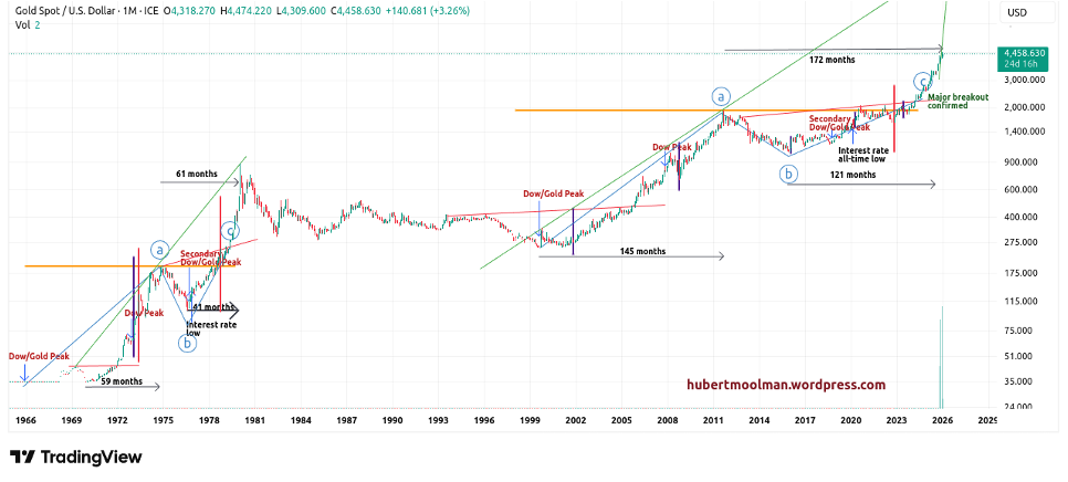
This gold chart shows one reason why we will see much higher gold and silver prices:
Warm regards
Hubert Moolman