Every year the Silver Institute publishes silver supply and demand numbers that suggest the market is in a deficit or surplus, although there is no correlation between their “market balance” and the price of silver. Investment decisions based on the Silver Institute’s supply and demand data can turn out badly.
In a previous article we have discussed that gold trades more like a currency than a commodity. An approach of a gold market balance, which produces a surplus or deficit, is therefore not appropriate nor indicative of price direction. Because silver is both a monetary metal and an industrial commodity its supply and demand dynamics require special attention. My conclusion is that silver, just like gold, trades more like a currency than a commodity.
Silver Is a Currency
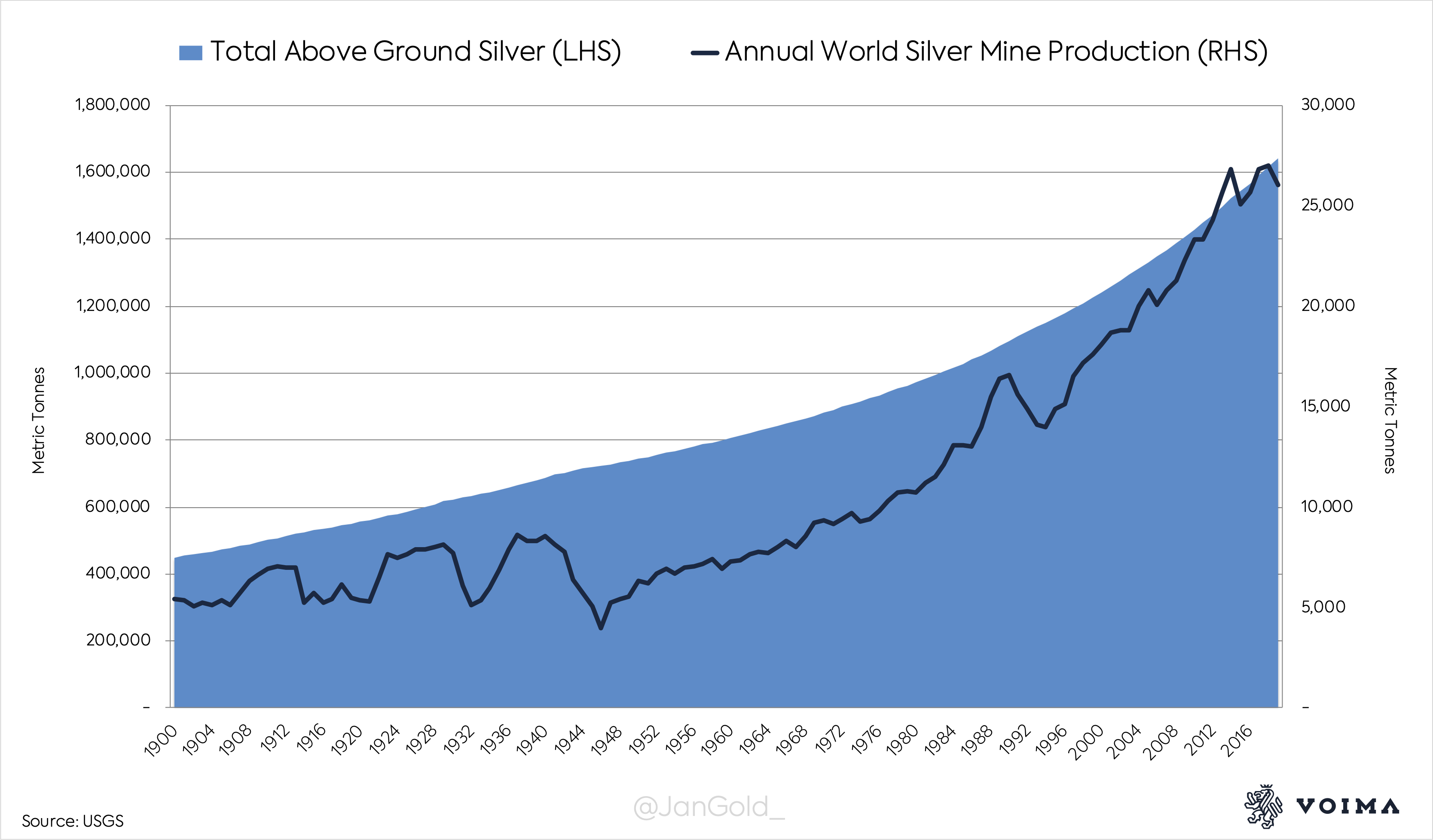
In ancient Sumer, roughly 5,000 years ago, silver was a unit of account, a medium of exchange for large purchases, and a store of value. Silver has been used as money in countless civilizations ever since. Because silver is durable and valuable very little gets lost. More than 90% of all silver ever mined is still above ground.
Since the 19th century silver is also being used for industrial applications. Currently, CPM Group estimates that half of all above ground silver is in industrial products, and the other half is in coins, jewelry, silverware and investment bars. The total above ground amount of silver is about 1.6 million metric tonnes.
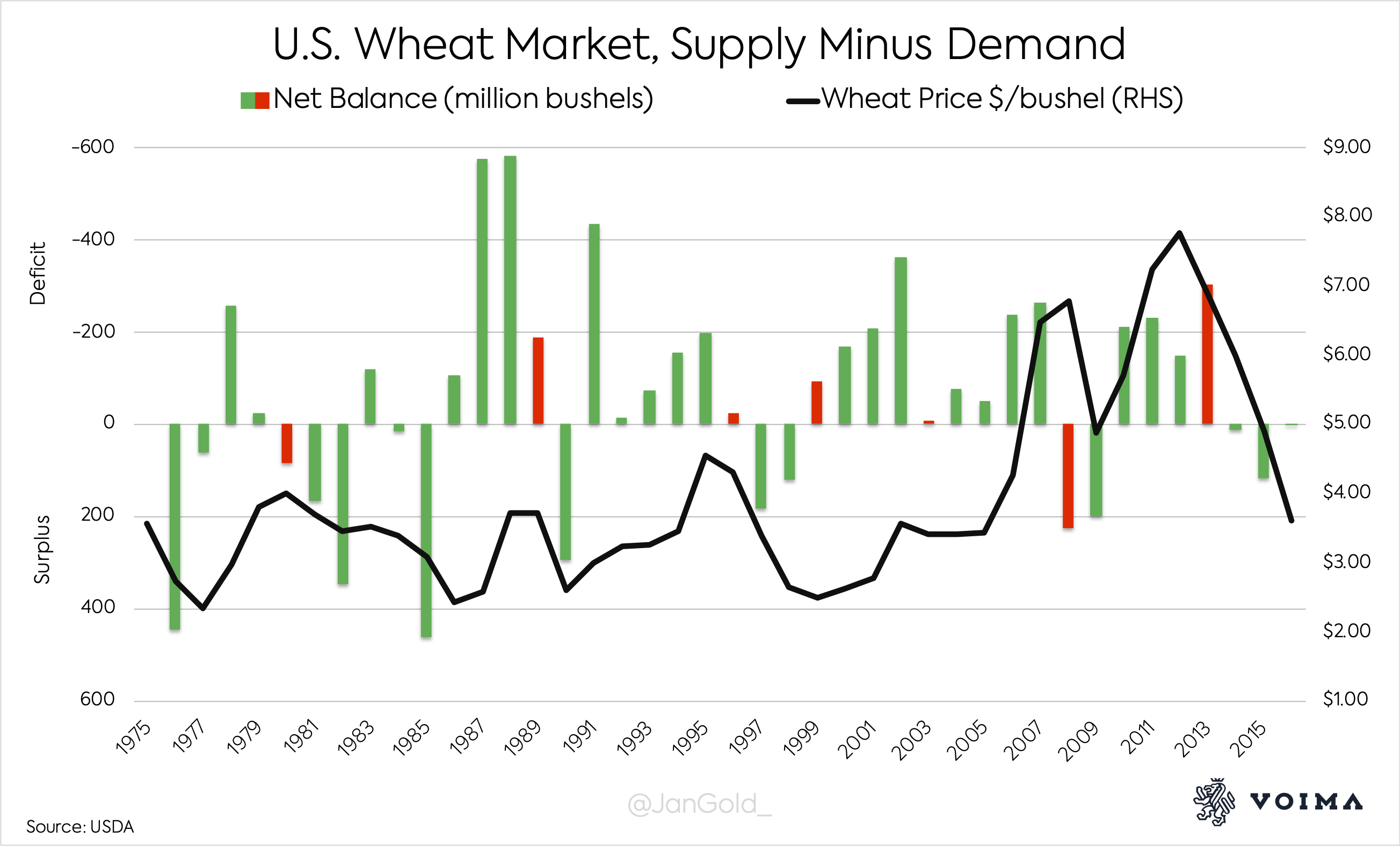
For perishable commodities a market balance, calculated by subtracting demand from supply, is indicative of price direction. This is because annual production is far larger than above ground stocks. When wheat demand rises, wheat supply can’t be quickly expanded—as there are no vast stocks that can enter the market—and the price has to go up. The wheat market balance tells us if there is a surplus or deficit in the market that will either decrease or increase the price of wheat.
Below is a chart that shows the wheat market’s net balance (supply minus demand). The Y-axis is inverted for more clarity. Whenever a surplus/deficit matches price direction the chart bar is colored green; if it doesn’t match the chart bar is red. You can see that most chart bars are green, and nearly all red bars signal at a price turning point.
For monetary metals, however, this approach is not suitable. The reason is the stock to flow ratio (STF), which is calculated by dividing above ground stocks by annual production. Silver’s STF is approximately 30. Annual silver mine production is 26,000 tonnes, and 800,000 tonnes of silver is in jewelry, coins and bars, which comprises the stock (at the right price this can enter the market as supply). For the sake of simplicity I choose not to count above ground silver that is in industrial products as stock.
Below is a chart that shows the silver market’s net balance as disclosed by the Silver Institute’s most recent World Silver Surveys. You can see that for the past 16 years the market was permanently in deficit, while the price went violently up and down. This reveals that the net balance disclosed is misleading.
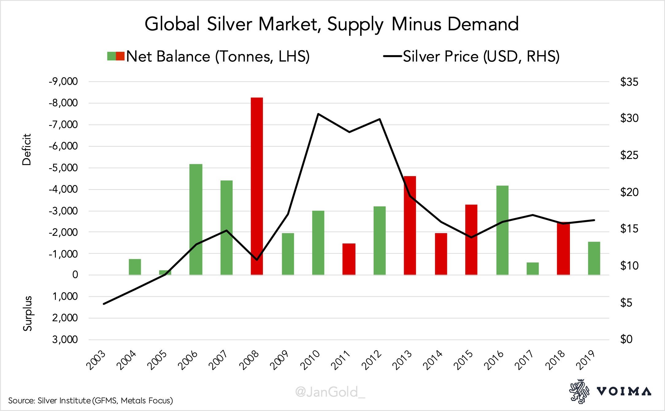
Yet, in the Silver Institute’s World Silver Survey 2018 it reads: “In the silver market, as for any commodity, physical imbalances both explain and influence price action…” In my view, for monetary metals there can’t be physical imbalances, because at the right price there is always enough metal.
For perishable commodities the forces of supply and demand put a strain on available stocks, which moves the price. But when stocks greatly exceed annual production, in the case of silver, it is mainly trade in stocks that sets the price. Silver trade is not limited to what the Silver Institute measures as supply (mainly mine output) and demand (mainly newly fabricated products). Worth mentioning is that the Silver Institute doesn’t disclose the actual amount of above ground silver, which is 1.6 million tonnes according to both the United States Geological Survey (USGS) and CPM Group. Instead, the Institute publishes identifiable bullion inventories that account for roughly 60,000 tonnes. No wonder most people are confused about silver’s STF.
Massaging the Numbers
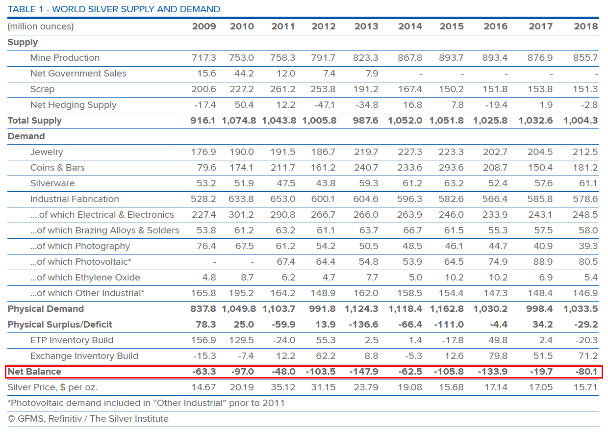
The Silver Institute has repeatedly changed their methodology in the past decades. Before 2013 there wasn’t a net balance disclosed in the World Silver Surveys. In those years, the difference between supply and demand was referred to as an implied net investment or implied net dis-investment.
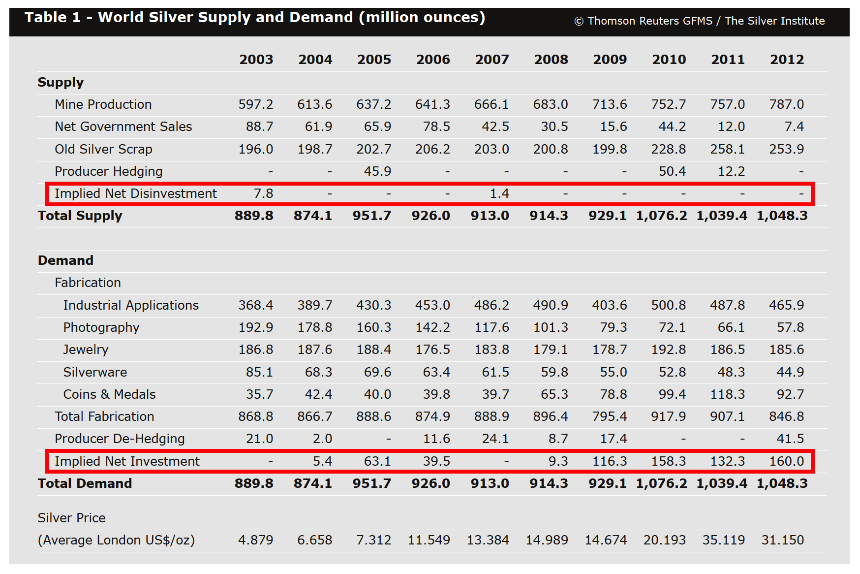
A market surplus was referred to as an implied net investment, and vice versa. To me this is odd, because when supply exceeded demand, the residual surplus (implied net investment) was supposedly a reason for the price to rise. In 2007, the Institute wrote: “The higher trading range [price went up] has to a large extent been supported by continued investors interest in the metal. … as our relatively modest net implied investment number for 2006 indicates, sentiment has tended to remain overwhelmingly positive.” This methodology was not accurate, as evidenced by the fact that from 1985 through 2012 implied net (dis)investment was positively correlated to the direction of the silver price only 54% of the time.
In 2013 the Silver Institute changed its methodology. Not only was the “net balance approach” adopted (exhibit 4), the numbers were also changed. Previous years of implied net investment (surplus), were flipped into negative net balance years (deficit). This can be seen by comparing the data for 2009, 2010, 2011 and 2012 in exhibit 4 and 5.
Conclusion
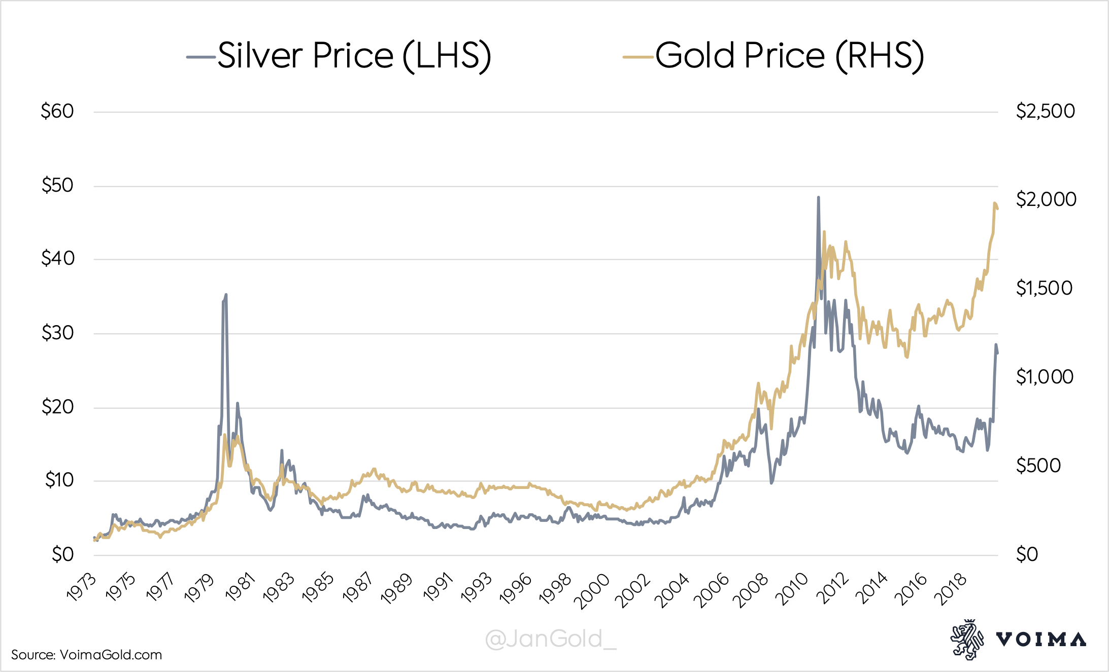
The above shows the difficulty for consultancy firms of presenting a market balance for what is chiefly a currency (monetary metal). My message is not that the Silver Institute’s reports are useless; they contain all sorts of valuable data. I’m just skeptical of any conclusion derived from a silver market balance—surplus or deficit. To me it makes more sense to focus on variables that also drive the price of gold—such as inflation, risk, and interest rates—to get a feel for silver sentiment. Note the correlation between gold and silver in the below.
Sources:
- Nieuwenhuijs, Jan (2019). How Much Silver Is Above Ground?
- Nieuwenhuijs, Jan (2019). The Essence of Gold Supply and Demand Dynamics
- Schnepf, Randy (2006). Price Determination in Agricultural Commodity Markets: A Primer
Nothing written in Voima’s blog or website constitutes investment, legal, tax, or other advice. It should not be used as the basis for any investment decision(s) which a reader thereof may be considering. The purpose of Voima’s blog is to provide objective, educational and interesting commentary and is not intended to constitute an offer, solicitation or invitation for investing in or trading gold.
About the author

![]()
Jan Nieuwenhuijs is a precious metals analyst for Voima Gold in Finland. Nieuwenhuijs is mostly specialised in gold, covering topics such as the Chinese gold market, the global physical gold market, derivative markets, central banks gold policy, and the international monetary system.
The views expressed on Voima Insight are those of the author(s) and do not necessarily reflect the official views or position of Voima Gold.
You are allowed to copy our content, in whole or in part, provided that you give Voima Gold proper credit and include the appropriate URL. The name Voima Insight and a link to the original post must be included in your introduction. All other rights are reserved. Voima Gold reserves the right to withdraw the permission to copy content for any or all websites at any time.
Nothing written in Voima’s blog or website constitutes investment, legal, tax, or other advice. It should not be used as the basis for any investment decision(s) which a reader thereof may be considering. The purpose of Voima’s blog is to provide objective, educational and interesting commentary and is not intended to constitute an offer, solicitation or invitation for investing in or trading gold.