It is normal for volatile reactions to happen at key levels (or a short time after), like previous peaks or upward-sloping resistance lines. Often these reactions (or consolidations) can have a similar shape or structure.
This was recently the case for the gold chart illustrated on my premium blog to project gold’s future movements. Here is an extract of that post:
Here is a comparison of the two patterns at the breakout lines from a close-up view:
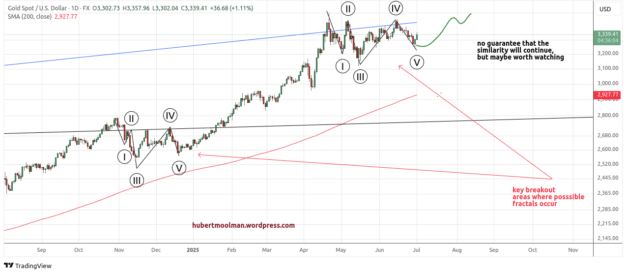
I have marked the two fractals to show how they are similar. If the comparison is justified, then we could see a strong move higher over the coming months.
A copy of the full post is here.
The two patterns occurred at similar upward-sloping resistance lines and were following a similar structure. The breakouts at both upward-sloping lines were important signals that price would go significantly higher should it successfully break higher.
It eventually did break higher, and after that, gold rose from about $3300 to the recent $5597.
The silver chart is now potentially facing a similar situation.
Here is a silver chart that I showed previously:
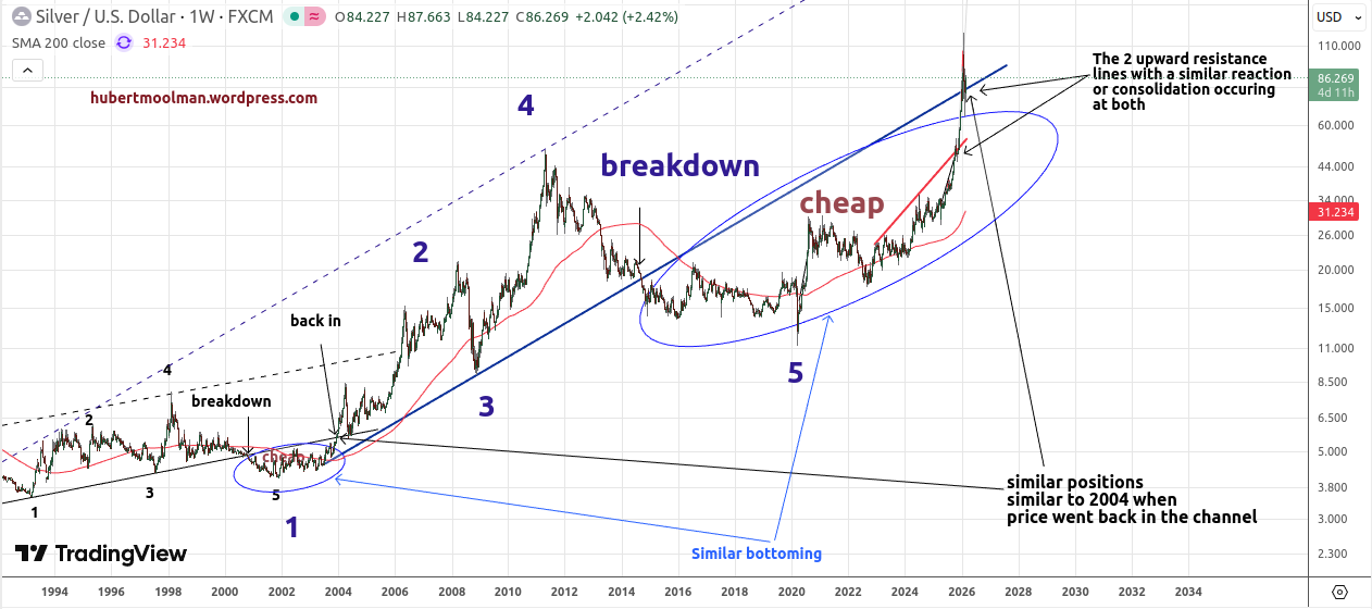
It shows two important upward-sloping resistance lines. The blue line is the bottom of the important channel described here. A break into that channel suggests that silver is roughly in a position similar to 2004.
The red line is an important trigger for a bullish pattern highlighted in a previous premium post. This pattern already reached its target shortly after the reaction/consolidation at the red line.There is now a similar pattern at the blue line (as can be seen on this chart):
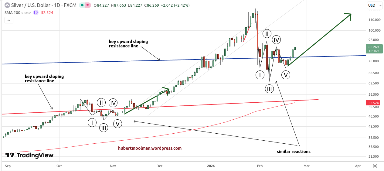
If these patterns continue in a similar manner, then we could see silver move past $200 over the coming months.
Warm regards
Hubert Moolman