We are going to look at strong evidence that the PM sector bottom is in and not only that – we will also see why downside risk here now looks minimal and why the next major upleg looks set to begin soon, even imminently.
The biggest giveaway that the sector bottom is in and that it should ascend from here soon is sentiment, which we can track via the Gold Miners Bullish % Index, which hardly anyone seems to use, despite the fact that it is a very reliable guide regarding what to expect, as we will now see.
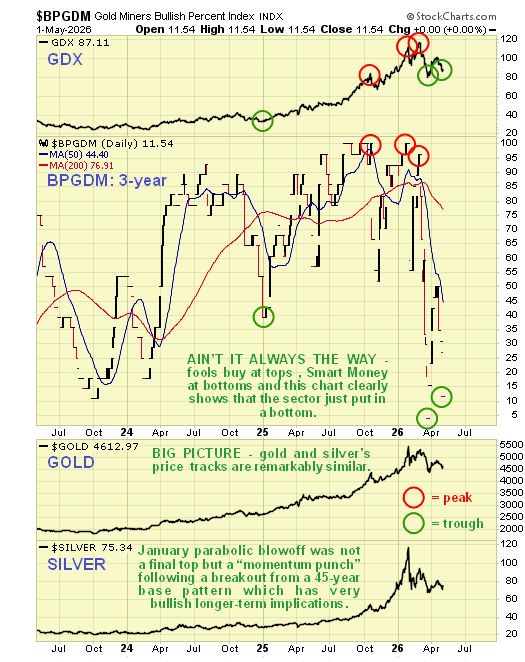
We will start with a 3-year chart for this sentiment index, on which we can almost immediately see what a reliable guide it is. So, not surprisingly, it shows that EVERYONE was bullish on the sector by the end of January when it reached 100% bullish, and that of course marked a top. However, after the late January - early February plunge triggered by the raising of margin requirements, it collapsed back to a dismal reading of 4% bullish by mid-March, and that of course marked an important low. The initial bounce off this low brought the reading back up to 50% which was too much too soon, so again not surprisingly, GDX dropped back quite steeply over the past week or so, and interestingly this has brought the % bullish back to the very low level of 11.5% - not as low as the 4% in March but still a healthy reading suggesting that the sector is late in the intermediate base building process. Before leaving this chart, observe the reading at the start of 2025, just before the great sector rally last year and into this year – ahead of this big uptrend the sentiment reading was already at 40% bullish, now it is at a meager 11.5%, so the upside potential from here is massive – and this low reading also means that downside from here is probably very limited.
![]()
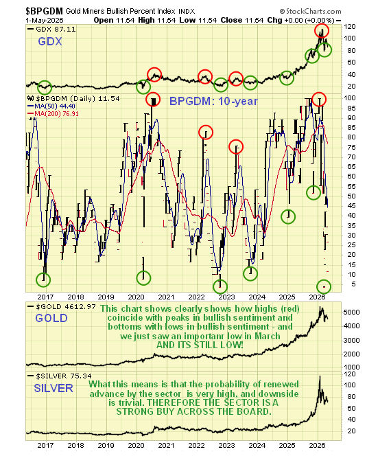
It’s also worth us taking a look at the longer-term 10-year chart for this sentiment index, which shows how reliably it has correlated with tops and bottoms repeatedly in the past. The paired red circles show the sentiment readings at the tops, and the paired green circles show the sentiment readings at the bottoms. The “so low its silly” reading in mid-March very probably marked the low for this correction, ranking as it does with the lowest readings of the past 10 years, and currently it is still at a historically low level. Put simply, this means big upside potential and very limited downside.
![]()
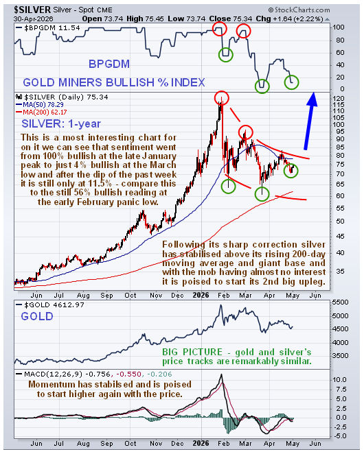
Alright, so how does the 1-year silver chart look now? We did see something of a reaction back after it broke down from the bearish Rising Wedge in the middle of April, as expected, but the reaction has been shallow, also as expected, and silver has started higher again over the past couple of days. It looks like it is readying to break out of what is believed to be a curved Pennant pattern that has formed from the January highs, an intermediate correction that has brought the price back to strong support above the rising 200-day moving average and above the very strong support near to the upper boundary of the gigantic 45-year Cup & Handle holding pattern that it broke out of decisively last Fall which is shown in the recent article SILVER – are we THERE YET?, the perfect place for it to form a base, which it has been doing, before embarking on a 2nd major upleg that should be as big and probably bigger than the 1st one following the breakout and it should be noted that the consolidation following this next major upleg is unlikely to give back as much of the gains as happened following the 1st upleg, which was a typical post-breakout reaction, as it will have completely escaped the “granitional pull” of the giant Cup & Handle pattern.
![]()
To those critics who weigh in saying “Silver’s done - that was a parabolic blowoff top in January and they are always followed by a bear market”, I counter that the massively overbought condition that had developed by then was a “momentum punch” in which silver celebrated breaking out above the resistance at the top of its giant 45-year Cup & Handle pattern, this momentum punch indicating that silver has begun a major bull market that is destined to take it to much higher levels that are hard to imagine for many now.
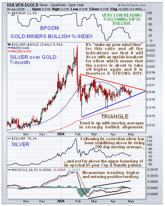
Now we come to the question of timing – when is this next major upleg likely to start? We will now look at a chart which suggests that the answer to this question is “Immediately – if not sooner”. I refer to the 7-month silver over gold ratio chart. On this chart, we see that, following the steep plunge in the ratio late in January and early in February, a fine Symmetrical Triangle has formed above the rising 200-day moving average. With the ratio pushing towards the apex of this Triangle, resolution, meaning a breakout, looks imminent and the strongly bullish alignment of moving averages coupled with the still very low reading of the Gold Miners Bullish % Index shown at the top of this chart and steadily improving momentum (MACD) all point to an upside breakout by this ratio – and therefore by silver and everything else, gold and PM Sector ETFs and stocks.
![]()
The conclusion is that we can now go ahead and buy the sector across the board with a high degree of confidence that it is going to take off higher and gains are likely to accrue fast as traders come down off the fence and pile in.
We looked at a good range of promising silver stocks in the recent past, and the next priority is first to list and then to write up a similar range of gold stocks as soon as possible.
End of update.
About the author