On Wednesday last week, the price of silver dropped from over $24.25 to just a bit over $23 before bouncing back to around $23.50. The next day, the price dropped again, briefly to around $22.60 before mostly recovering (but a dime to a quarter down).
Let’s look at the graph of the price and basis (i.e. abundance) action for 28 and 29 October.
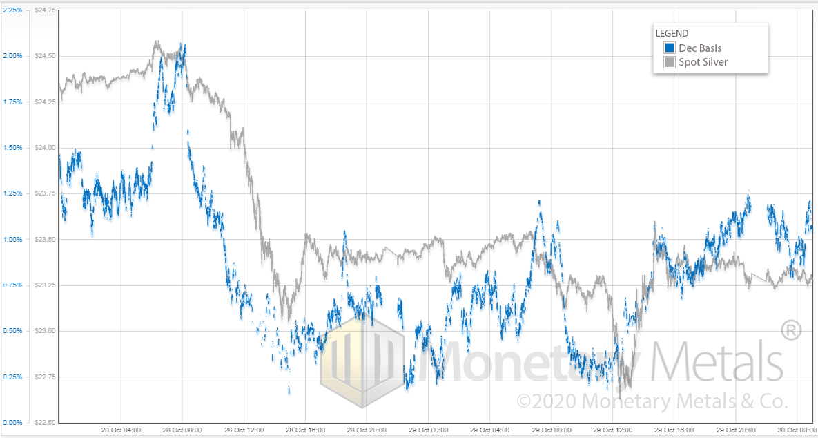
At the end of the day (second day), the price is about a buck lower. And the basis (i.e. abundance) is about 50bps lower.
Note the rise in basis leading up to 8am Wednesday (London time, i.e. when Asia is online), with little rise in price. And then again around 18:00 (i.e. early afternoon in New York). And again 8:00 the next day.
Then the basis drops as the price drops. And rises as the price rises. Once the price is stable at its new level around $23.35, the basis seems to want to take off again.
We had some selling of physical metal here. No doubt about it. Silver is slightly less abundant to the market at the lower price—but not that much less.
Those futures traders are itchy to buy into the next rally. Are they right?
Historically Skeptical
Many times in the past, we’ve expressed our skepticism at this idea. And we were right to be skeptical, for years. During the period Q2 2011 through Q1 2019, silver futures traders were not right about their expected big silver move up. It was not to come when they expected.
Towards the end of March of 2019, the silver price finally had its bottom just under $12. Then for about a year and a half, it rose to nearly two and a half times that. And since August, not so much.
What has been happening since August? Up through August 10, we see a steady move down in the basis corresponding to the rise in the price of silver (i.e. drop in the price of the dollar, measured in silver). This was a period where the basis recovered from its blowout in the wake of COVID lockdowns.
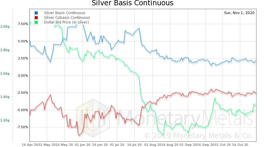
Since then, we’ve had rising dollar (i.e. falling silver price, measured in dollars) and a bit of a drop in basis. Silver bulls can take solace in the fact that the big rise in the dollar in September had a corresponding drop in silver’s abundance. And the basis does not look like a rising trend.
However, this chart is not exactly screaming “buy silver”.
Our Economic “Recovery”
After reading yet another article on how strong the alleged economic recovery is—GDP is certainly up—we came across one on how businesses borrowed to help them get through the lockdown, That is, they substituted loans for sales. Debt for revenues. Seed corn for a harvest. This is like a laid-off worker substituting a credit card for his former salary—and his spending certainly adds to GDP. But that summary number is misleading.
Misleading? How So?
Let’s look at a hypothetical example. Suppose you own a restaurant near a stadium. Pre-COVID, revenues were $100,000 a month. You were doing exceptionally well, and on that revenue you earned 10% net margin, or $10,000. With lockdown, your revenue dropped to zero for four months. With no sports, concerts, or events at the stadium, your revenue after unlock is 10% of what it was. It slowly climbs. Assuming no re-lockdown, it may get to 40%, but without the stadium it will never be what it was.
During the lockdown you needed $30,000 a month just to stay afloat. After reopening, you need $15,000 a month for 8 more months. Assume that revenues after that stabilize and that you are somehow profitable. Your total debt increase is 4 X $30K + 8 X $15K = $240,000.
At your old pre-COVID revenues, you could pay this off in two years. Assuming you took home no profits, and there are no taxes. More realistically, this would be at least 5 years, and that would mean five lean years of belt-tightening.
But your new revenues are not $100K, and your net margin is not 10%. They are $40K and your net margin is 5% (this is probably generous). So you are taking home $2,000 a month. With no tax and taking home no money, it would take you 10 years to pay the debt off. With the same assumptions as above, it would take 25 years.
This Isn’t a Recovery
Some businesses will take on an even greater burden of debt. Others are more fortunate and incurred less debt. The point is that it may look like everything is OK to an outsider. But it’s not OK. Debt does matter. If the restaurant does not pay the debt, then its lenders will foreclose.
Generally, it’s difficult-to-impossible to sell a business without clearing the debt. Why should someone else take on the burden? And small business owners generally have had to sign personal guarantees of the loans to their businesses. So closing the doors means personal financial ruin.
We’ve written about the mistake in thinking that the economy is stateless. For example, any formula that purports to predict price changes based on changes to the quantity of dollars is a stateless function. This restaurant story shows that economic actors are actually stateful. A restaurateur who is in debt up to his eyeballs, and tightening his belt to service it will not behave the same as he did prior to incurring the debt.
And we’ve written about the mistake of treating GDP as a measure of the economy. Spending borrowed money adds to GDP just as much as spending revenues. But it has a different effect on the state of people and businesses.
We’ve written in the past about the concept of Marginal Productivity of Debt (MPoD). This is the idea of looking at how much GDP is added with each fresh newly borrowed dollar of debt. It is change in GDP divided by change in debt.
Here is an updated chart through 2Q 2020.
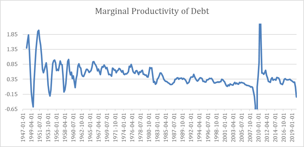
Source: St. Louis Federal Reserve (debt = ASTDSL + ASTLL, GDP = GDP)
One item of note, the Fed seems to have changed how they report these data series. We kept our old data up through 2Q 2017 and used the new data after that. We do not believe that the change is big enough to make a significant change in the appearance of this graph.
Four features are readily visible.
One is the long-term trend starting after WWII is falling (we wished they published older data so we could see this back to 1900 or ideally 1789).
Two, an incredible discontinuity occurred at the time of the last financial crisis.
Three, after that crisis, the trend has been down steadily since 2010.
Four, as of 2Q this year, it’s not only dropped but it has gone negative again. But even in Q1, MPoD was just 9 cents. We eagerly await the 3Q data.
And it makes sense. As people, businesses, corporations, and governments from McKinney TX to the federal government borrow more to spend more, they are desperately trying to add to GDP (well, really to add to their own consumption, which is enjoyable). However, then they are saddled with the debt burden which does not go away for years or decades (or ever, in many cases such as McKinney). No doubt, debtors would enjoy consuming just as much as those who are not yet in debt. However, they become saturated.
Saturation is an interesting way to understand the secular decline in MPoD.
© 2020 Monetary Metals
About the author