There were several developments last week that taken together suggest that the short-term bearish scenario set out in the Gold and Silver Interim update about a week ago is not going to materialize and instead that the original grander scenario described in the last full Silver Market update is going to prevail. This is a relief because any further downside would have ruined the giant positive pattern completing on the long-term charts, especially that completing in gold.
What are these developments? There were 3 main ones. The first is that last week a run of bullish long-tailed candlesticks appeared on silver’s chart, which we can see to advantage on its 1-month chart below. They are bullish because they indicate that the market is rejecting lower prices and show that buyers were snapping at silver whenever it dipped. This past week was also characterized by a run of dojis (open and close almost at the same price), which is a sign of indecision and is bullish if they occur after a significant drop, which they did. In addition there were two distinctly bullish candlesticks last week, a bull hammer on Tuesday and a dragonfly on Thursday.
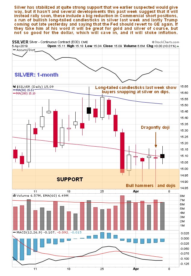
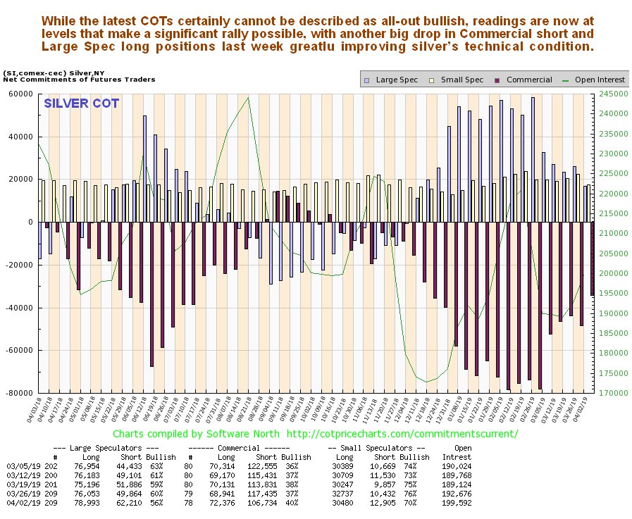
The second important development last week is that there was a big improvement in silver’s COT structure, with the Commercials scaling back their short positions substantially and the Large Specs their long positions. While positions are not at levels that can be described as all-out bullish, they have certainly moderated sufficiently to permit a significant rally at any time.
Click on chart to popup a larger, clearer version.
The third significant development is that Trump declared after Friday’s close that the Fed should revert to QE again, meaning QE4. If they take him at his word the dollar is going to suffer terribly this time round which will ramp up inflation – good news for gold and silver.
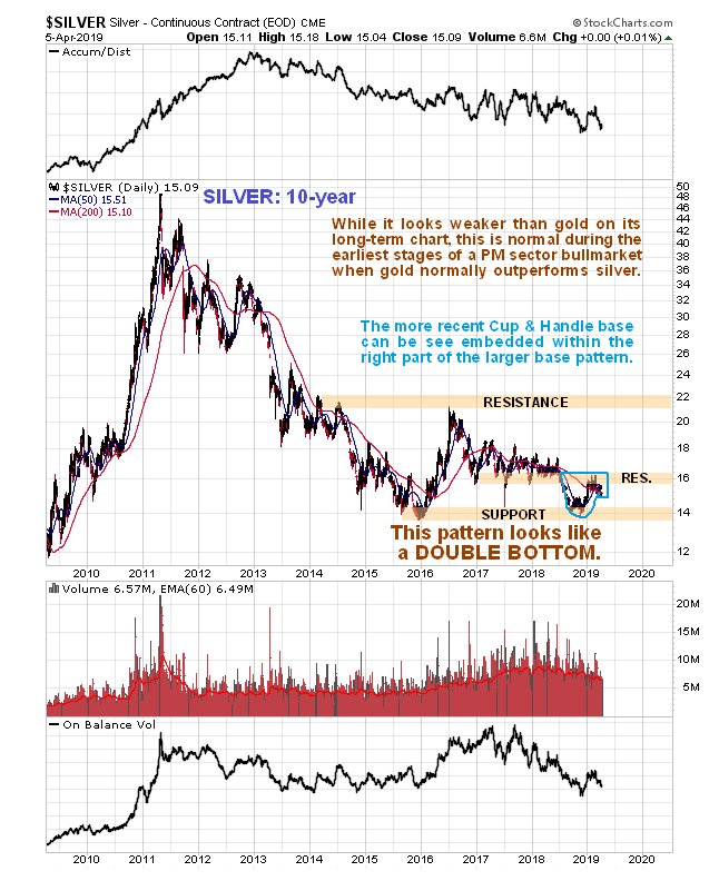
Now let’s swiftly review the other charts, the most important of which as we will see is the 15-month silver chart.
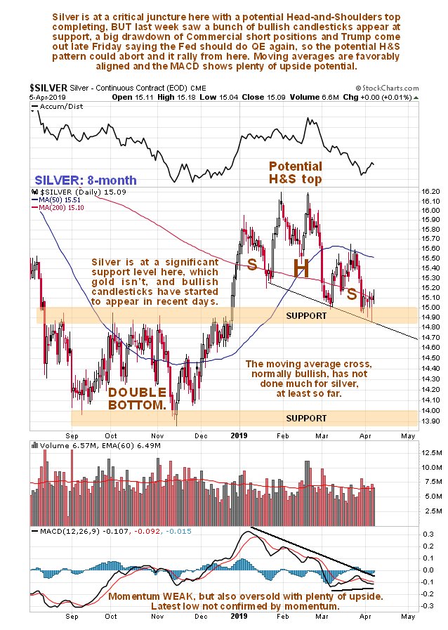
Starting with the 8-month chart you can see the potential Head-and-Shoulders top which got us worried. Although it looks too steep to be valid, there is a parallel flat-bottomed one in gold, which lent this one validity, especially as the volume pattern up to a week ago had been negative. On the plus side the appearance of a string of long-tailed candlesticks at important support last week certainly looks positive, and the flip side of the recently weak momentum (MACD) is that silver is now somewhat oversold with plenty of upside potential.
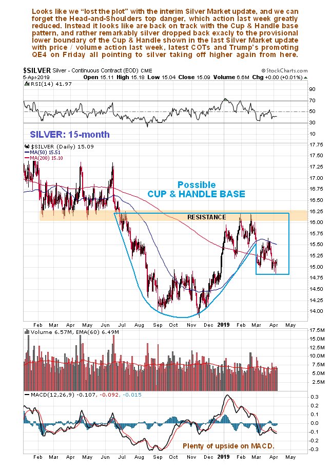
But it is the 15-month chart that really “gives the game away” for this chart shows, as it did when we first identified this pattern back early in March in the last full Silver Market update, that silver is completing a large Cup & Handle base pattern, and that the drop of recent weeks fits neatly within the boundary of the Handle of the pattern that we had earlier delineated, meaning that the further drop of recent weeks can fairly be described as “a storm in a teacup”, or to be perfectly accurate, “a storm just outside a teacup”. What is interesting is that the latter part of the drop last week terminated exactly at the point described as the probable low point for the Handle back in the early March update. Thus, if silver turns up here as it looks like it will, all well and good and it should then proceed to advance to the resistance at the upper boundary of the pattern at about $16.20 and then in due course break out from the entire base pattern, which looks likely to synchronize with gold breaking out above its key $1400 level.
Finally, we will end by briefly reviewing silver’s long-term 10-year chart which looks rather more messy than gold’s on which there is a fine giant Saucer base pattern. On silver’s chart in contrast we see that instead of a Saucer pattern, it appears to have marked out a giant Double Bottom, with the 2nd low of the Double Bottom being comprised of the Cup and Handle base described above. As we can see by comparing this with the 10-year chart for gold in the parallel Gold Market update, silver is much closer to its lows of recent years than gold is. This is normal for this stage of the cycle, as at the end of major PM sector bearmarkets, or in the early stages of bullmarkets investors favor gold over silver which they see as more risky, which is what attracts them more to silver towards the peak of the cycle when they are less risk averse.
End of update.
About the author