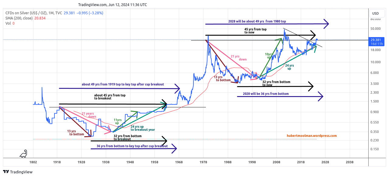
Previously, I presented the following long-term silver chart (only closing values and this time monthly):
 More details on the chart can be found here. Over the last 125 years, the silver chart has formed two remarkably similar patterns. The 49-year pattern from 1919 to 1968 has a similar form to the one that started circa 1980. Here, I have pointed out their similarity as it relates to time.
Although the patterns are similar in basic form (they are both cups) and time, there is a big difference when it comes to the magnitude of price movement. For example, the price movement from the bottom (1932) of the first pattern to the top (1951) after about 11 years (from the secondary bottom) was 3.18 fold, whereas the movement from the bottom (1992) of the second pattern to the top (2011) after about 10 years (from the secondary bottom) was 13.09 fold.
This proves there was already significant outperformance (about 4.12 (13.09/3.18) times) during the formation of the current pattern. If this outperformance continues (which it likely will), then we can expect massive silver rallies for the rest of this decade.
The silver peak of 1968 was about 8.93 (2.5/.28) times higher than the 1932 low. A similar performance from the 1992 low would give a price of $32.68 (3.66x8.93) in 2028, but this price was already exceeded (prematurely) during the formation of the current pattern, again proving outperformance.
If we calculate a similar peak and assume that the current outperformance will continue to be of the same magnitude, then we get a peak of $134.65 ((8.93x4.12)x3.66) in 2028. However, it will probably be much higher since the calculations are based on a chart that only contains closing values.
There are also reasons why the current pattern will likely outperform the previous pattern at an even greater rate. I'll be discussing these in my premium blogs.
Warm regards
Hubert Moolman
And that, knowing the time, that now it is high time to awake out of sleep: for now is our salvation nearer than when we believed.

