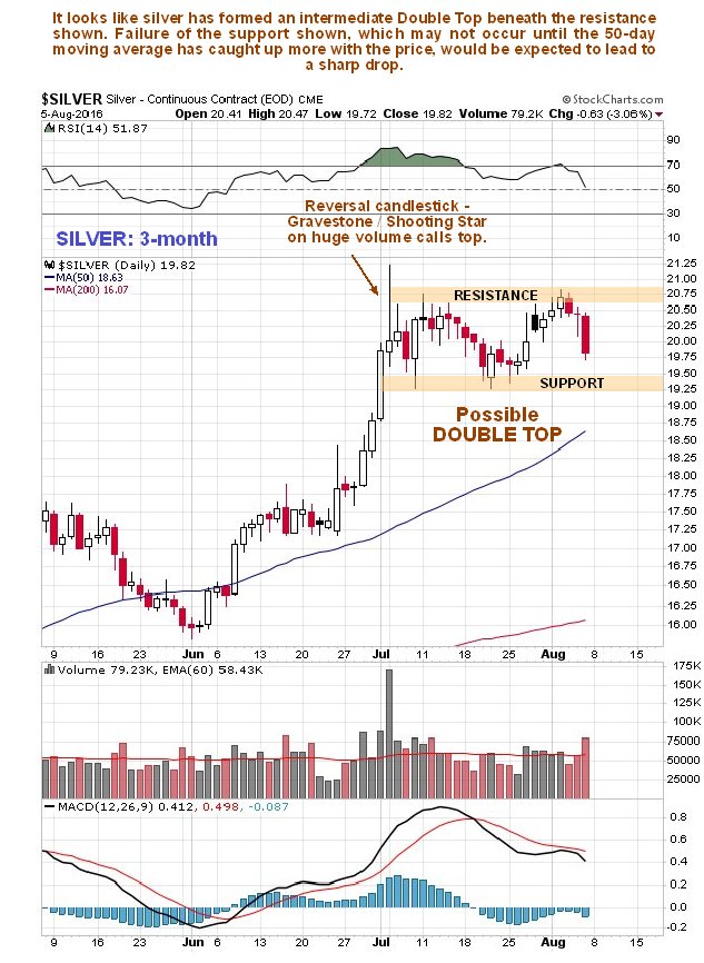
Having hit a target silver has formed what is believed to be an intermediate top over the past 5 weeks or so, which it should soon start to descend from.
On its 3-month chart we can see this presumed topping pattern started with the appearance of a prominent “Gravestone Doji” or “Shooting Star” candlestick early in July, with its negative implications being amplified by its having occurred on very high volume. While moving averages are in bullish alignment, the now yawning gap between the 50-day and 200-day makes a correction likely. After dipping back during August, the price rallied towards the highs early this month, and then failed, dropping hard on Friday, making it very likely that a Double Top is completing.
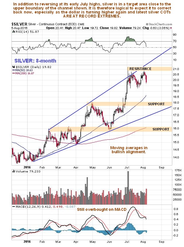
On the 8-month chart, we can clearly see why silver is likely to form an intermediate top here – it has risen up to become very overbought at the top of the expanding channel shown. A reasonable objective for a correction is the support level shown at and below $18 and the lower boundary of the channel not far beneath it and it could drop further. With the dollar turning higher and silver latest COTs at frightening extremes it is not hard to see why it might drop soon. Normally such COT readings would lead to severe losses.
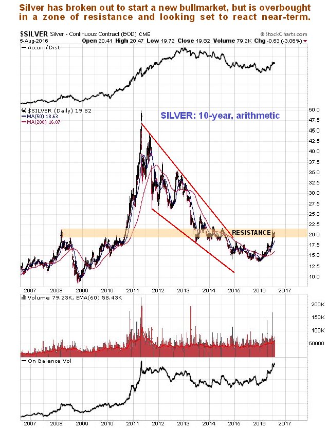
The long-term 10-year arithmetic chart gives us a much broader perspective. This is actually a very positive chart overall, for as we can see silver’s bearmarket phase from 2011 has definitely ended. However, it has risen quite sharply in recent months to arrive at a zone of significant resistance, so it is quite normal for it to consolidate or react back here, before later breaking above this resistance and continuing higher.
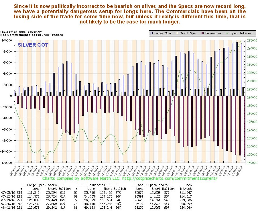
The latest COT chart shows that Commercial short positions have achieved a new record extreme, which last week was due to the Small Specs pitching in in a big way. The Commercials appear to have been wrong up to now, but 9 times out of 10 things work out in their favor, so this looks like a truly menacing setup for longs. If you think the Large Specs are right, you ought to ask the question “Where were they when silver was bottoming last December and January??”
Click on chart to popup a larger clearer version.
If you think the last chart looks scary, then try this next one for size. On the long-term Hedgers chart, a form of COT chart, we can see the Hedgers short positions dropping off the edge of the chart. Could it really be different this time, so that they are forced into a short covering panic? Well, maybe, since we know some things are showing signs of unraveling, like the European banks, the trend towards helicopter money and the drift towards major wars, but these things like time, and the price charts we have looked at above suggest that now is a very risky time to bet against these big money players. The red dotted line on the Hedgers chart is a bearish extreme, and remember, that is not my determination, but that of sentimentrader.com
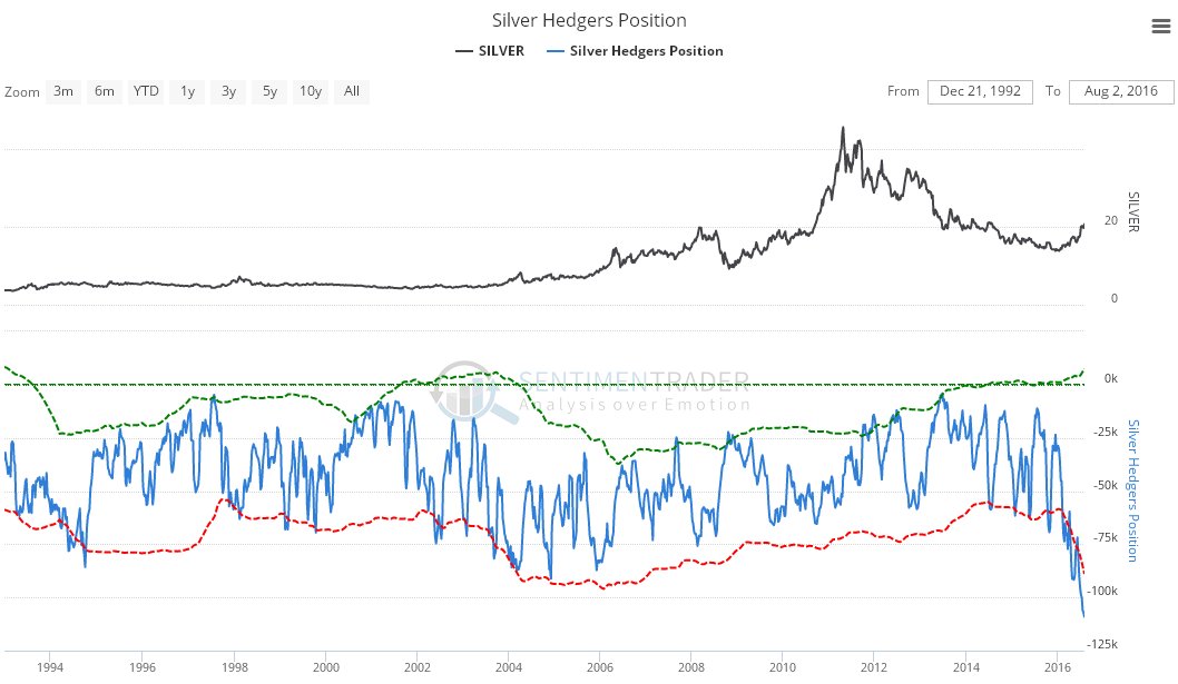
Click on chart to popup a larger clearer version.
Chart courtesy of www.sentimentrader.com

