Despite their well-earned reputations as stable assets and safe havens, gold and silver have become highly volatile in recent weeks, with sharp moves in both directions.
This marks a significant change in behavior and has sparked widespread discussion across the financial world, particularly after last week’s steep declines. Gold dropped from $4,400 to $4,000, a loss of about 9%, while silver fell from $54 to $48, or roughly 11%, all within just a couple of days.
This volatility was entirely foreseeable, however. I explicitly called for it back in August, at a time when the precious metals space was eerily calm and before gold’s $1,000-per-ounce surge in the fall. Today’s piece follows up on that earlier analysis, contextualizes the recent swings in precious metals, and explains why the current wave of volatility should settle down soon.
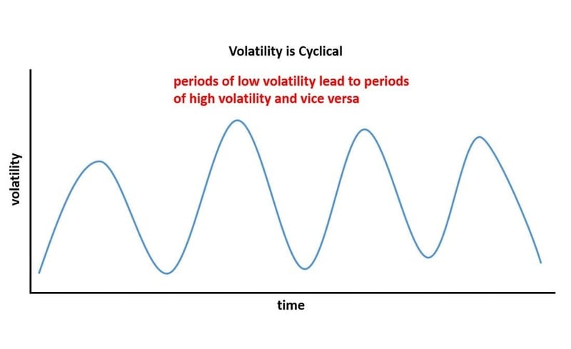
Volatility in financial assets and markets is highly cyclical. While asset prices like precious metals and stocks may not follow clear cycles, the volatility of those prices does, consistently moving through repeating phases of low and high volatility.
Periods of quiet, low volatility tend to build pressure that leads to sharp spikes in volatility, which then eventually subside, starting the cycle again. See the diagram below for a visual of this repeating pattern.
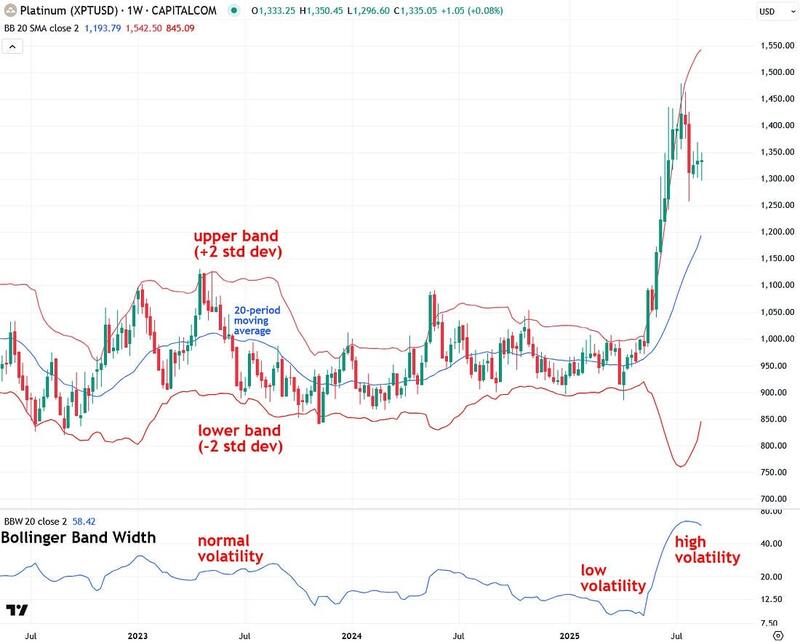
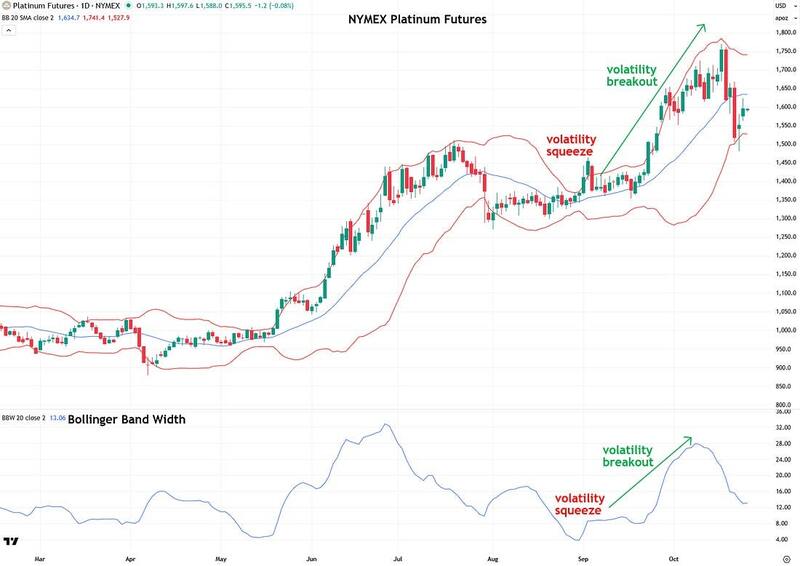
Next, let’s discuss how volatility can be measured and monitored in the real world. While there are a number of ways to do this, one of the most efficient and widely followed is to use an indicator called Bollinger Bands, which, when applied to a chart of an asset such as platinum in the example below, envelops the price.
The way the Bollinger Bands indicator works is that it takes a 20-period moving average of the asset’s price (the blue line in the chart below), and then upper and lower bands (the red lines in the chart below) are plotted two standard deviations above and below the moving average.
There are several ways to use Bollinger Bands, such as treating the upper band as a resistance level and the lower band as a support level. However, that’s not the focus today.
Instead, I’m going to focus on the width of the Bollinger Bands as a way to measure the volatility of the asset they’re applied to. Simply put, when the bands are close together, the asset has low volatility; when the bands are wide apart, the asset is experiencing high volatility—based on the past twenty trading periods, whether measured in days, weeks, or another timeframe.
While it’s easy to eyeball the Bollinger Bands to gauge their width and the asset’s volatility, there is another helpful related indicator called Bollinger Band Width that makes this even easier.
You can see it plotted on platinum’s weekly chart below. The chart shows clear periods of normal volatility, low volatility, and high volatility. When an asset moves sideways for a while, volatility is low, and when it trends strongly either up, as platinum has in recent months, or down, volatility is high.
Now that we’ve briefly covered the theory behind how volatility works in financial markets and how to monitor it, I want to discuss the powerful concept of a volatility squeeze. As mentioned at the start of this report, volatility is highly cyclical: periods of low volatility are followed by periods of high volatility, and vice versa.
More specifically, periods of extremely low volatility, known as a volatility squeeze, often precede explosive volatility, known as a volatility breakout. This makes volatility squeezes highly valuable to watch for, as they frequently occur just before large, tradeable moves in either direction.
In fact, a high percentage of major bullish and bearish moves in markets are preceded by these squeezes. Volatility squeezes can be thought of as a spring compressed under pressure that snaps back violently once released.
It’s also important to understand investor and trader psychology during volatility squeezes. During these periods, the asset drifts sideways within a range, news flow is minimal, and boredom and discouragement set in as traders lose interest and shift their attention to more active markets. It’s often at that very point, when most eyes are elsewhere, that a major catalyst appears and propels the asset out of its volatility squeeze into a strong new trend.
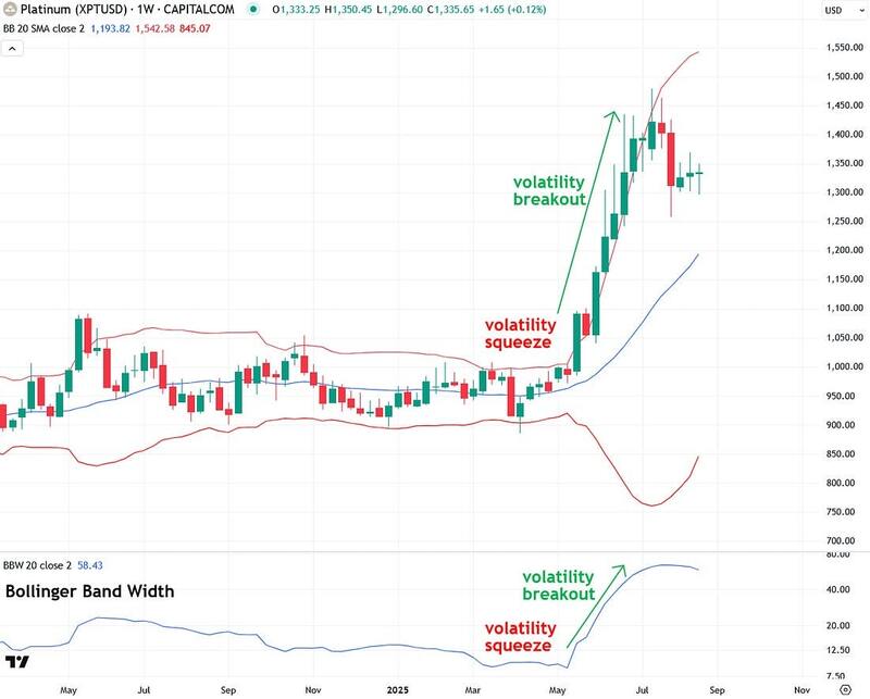
Returning to the platinum example below, from March to May, the metal entered a clear volatility squeeze, visible in the narrowing Bollinger Bands and confirmed by the Bollinger Band Width indicator beneath the chart. During this period, traders grew bored and shifted their attention to more active markets.
Then, on May 20th, platinum broke out explosively, surging nearly 50% over the following two months and sending volatility sharply higher. This is a textbook example of a volatility squeeze, and they occur regularly, yet most traders are unfamiliar with the concept and are often caught off guard by these powerful moves.
Now that the background is out of the way, let’s get into the recent and current action in precious metals. Hopefully, you read the two articles I published back in August, where I highlighted that both gold and silver were in rare volatility squeezes that I expected to lead to explosive moves.
This is the follow-up to what happened next. As predicted, those volatility squeezes during the summer gave way to powerful volatility breakouts in the fall. That breakout was reflected in the sharp price surges in both gold and silver.
To my knowledge, no other analyst was calling for this scenario.
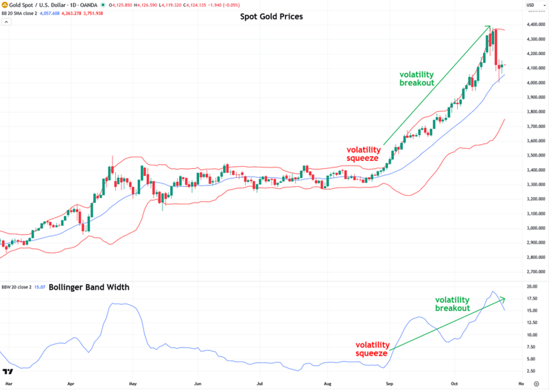
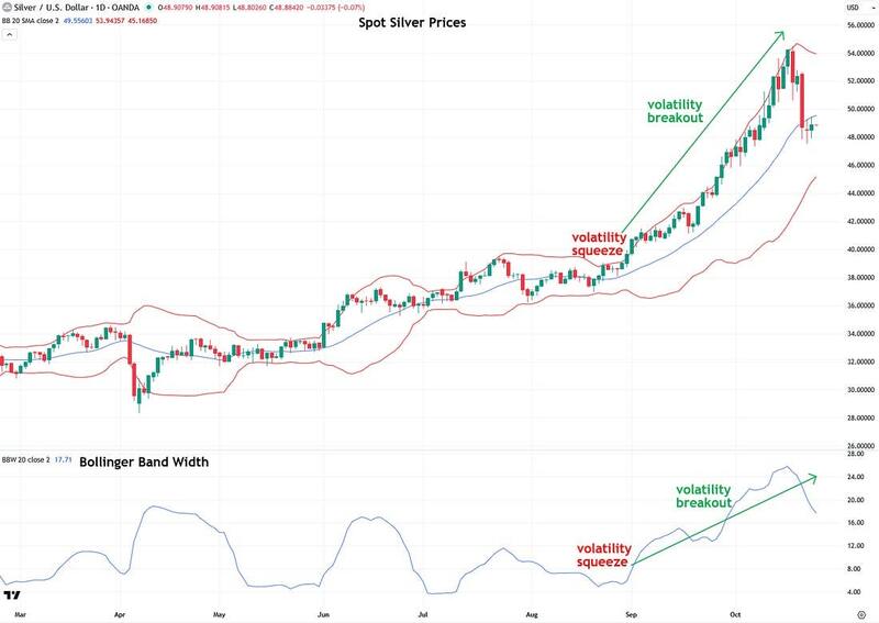
Let’s start by looking at what happened with gold. In August, it formed a clear volatility squeeze, followed by a breakout as prices surged by roughly $1,000 per ounce. This breakout is clearly visible in the widening of the Bollinger Bands around the price, as well as in the rise of the Bollinger Band Width indicator below the chart.
The heightened volatility over the past two weeks occurred in both directions, up and down, which explains why the recent pullback over the past few trading sessions was so sharp.
The volatility squeeze and breakout are also clearly visible in the chart of silver:
Interestingly, a volatility squeeze and breakout also occurred in my proprietary Synthetic Silver Price Index (SSPI), which I use to confirm that moves in silver are genuine and not false signals:
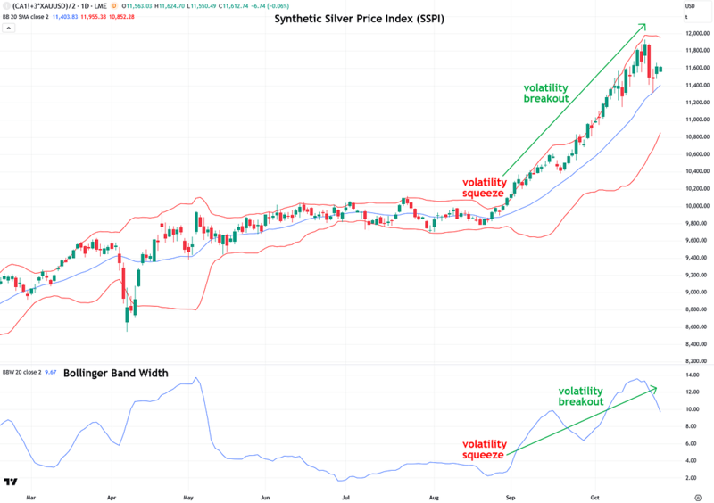
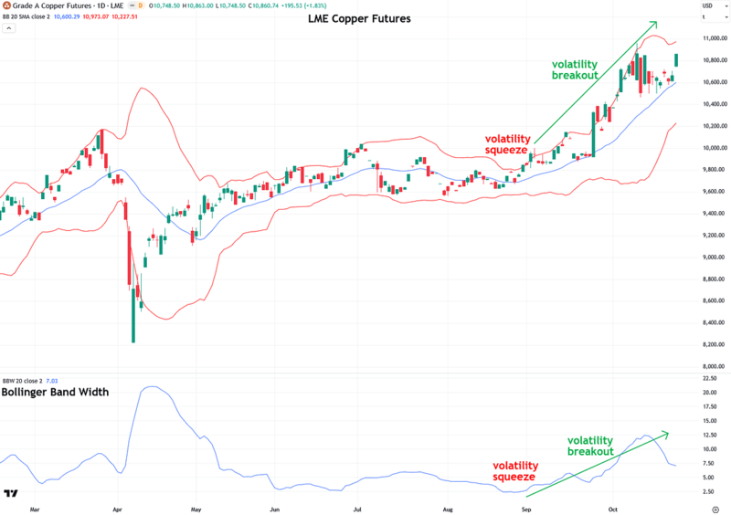
The same pattern occurred in copper, which has a major influence on the price of silver. This is why copper is included as a component of the Synthetic Silver Price Index.
It wasn’t just traditional precious metals like gold and silver that exhibited volatility squeezes and breakouts. Platinum showed the same pattern as well:
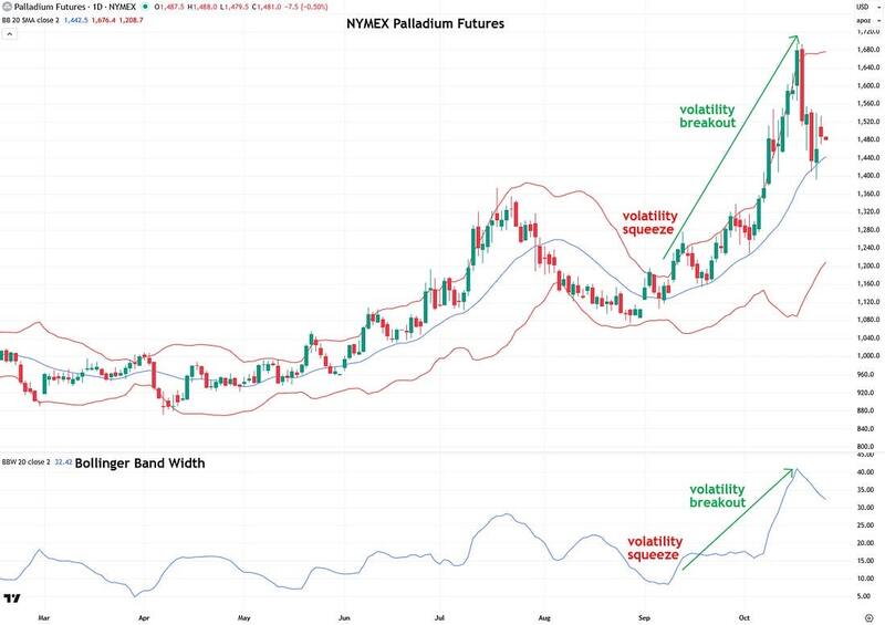
And so did palladium:
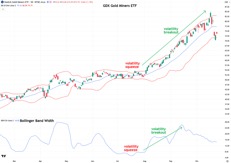
And lest you think it was only the metals themselves that experienced volatility squeezes and breakouts, that was not the case. The same pattern is clearly visible in gold mining stocks and ETFs, such as the popular GDX shown below.
The GDXJ junior gold miners ETF, although not pictured here, exhibited the exact same pattern. This surge in volatility explains why mining stocks have seen such sharp moves recently, both upward and downward.
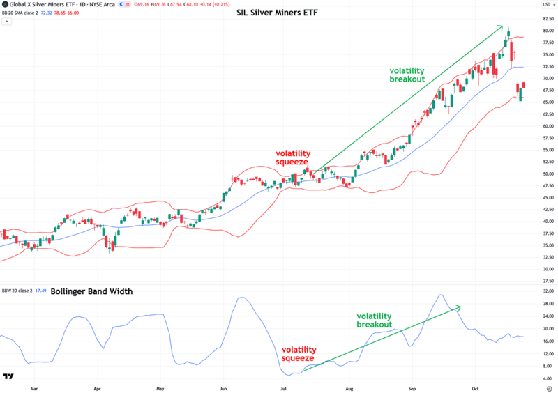
Silver miners showed the same pattern, as seen in the SIL Silver Miners ETF. The SILJ Junior Silver Miners ETF, although not shown here, followed the exact same pattern.
At this point, I hope the case is clear for why volatility is currently so elevated across the entire precious metals space, including both the metals themselves and the miners.
As discussed at the beginning of this piece, due to the cyclical nature of volatility, the extremely low volatility seen over the summer gave way to extremely high volatility this fall.
So where is volatility heading next? Hopefully, you’ve gotten the gist by now. Volatility is likely to subside significantly from here, and it has already started to decline.
This is evident in the narrowing Bollinger Bands and the falling Bollinger Band Widths on all of the charts above for the metals and mining stock ETFs. The easing of volatility will be a welcome relief for many precious metals investors, myself included, who are ready for some peace and calm after the recent gut-wrenching moves. I believe that is exactly what we are about to see.
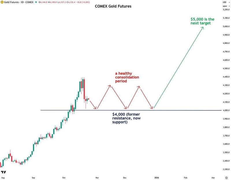
Now I want to discuss how I expect this declining volatility to manifest in the precious metals space, using gold as the example since it is the leader of the group.
I anticipate that precious metals will consolidate sideways as they work off their overbought conditions. This type of price action is typical during periods of declining volatility. I view these consolidations, which have already begun, as a healthy development—similar to a runner catching their breath after a powerful sprint.
My theory, though not a hard prediction, is that gold’s consolidation will occur above the new $4,000 floor. I expect it to fluctuate around this level for some time, possibly re-testing $4,000 several times as it works off its overbought condition. This consolidation should help gold conserve and build energy for its next move higher, which I expect will take it to $5,000 in 2026.
That outlook is shared by major institutions including Goldman Sachs, Bank of America, HSBC, and Société Générale. In addition, JPMorgan CEO Jamie Dimon, who is not exactly known for being a gold advocate, recently said that gold “could easily go to $5,000 or $10,000 in environments like this.”
It will be interesting to see if precious metals form another volatility squeeze in the coming weeks or months, which would set the stage for gold’s surge to $5,000. This is something to keep an eye on.
Anyway, to summarize: while much of the financial world has been shocked by the recent volatility in precious metals and mining stocks, anyone who has been following my work and is familiar with the cyclical nature of volatility, along with the related concepts of volatility squeezes and breakouts, was not only unsurprised by the sharp recent moves but was expecting them.
The good news is that volatility is now likely to subside through the end of the year, bringing precious metals back in line with their historically more stable character. This period of consolidation will likely set the stage for the next leg higher.
Remember, gold, silver, and the miners are only 1.6 years into what I see as a powerful secular bull market. These typically last a decade or more, and I fully expect this one to do the same. As always, I will keep you apprised of what I am seeing.
If you found this report valuable, click here to subscribe to The Bubble Bubble Report for more content like it.
About the author