I would like to take an in-depth look at Sliver and show you the bottoming process that finally came to an end in late May of this year. There is no question that silver as been the laggard when it comes to the PM complex similar to what we saw back in the early 2000’s when gold led the way for the rest of the PM complex. Silver eventually caught fire and actually topped out in April of 2011 a full five months before gold and the PM stock indexes. If you’ve been trading silver for any length of time then you know when it moves it can make up lost ground in a hurry.
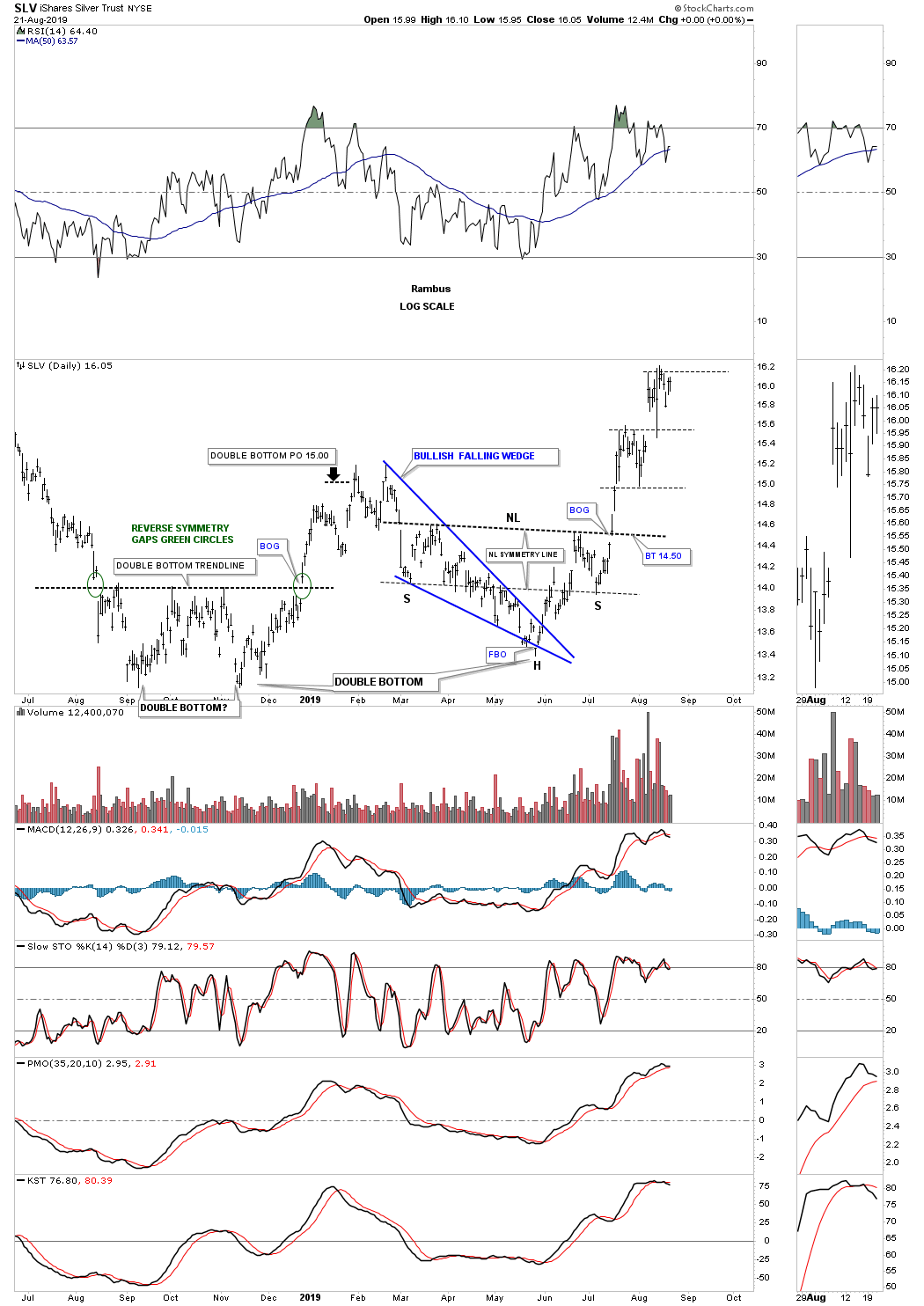
Since the early 2016 low SLV has been trying to bottom around the 13 area. Every time it would find support and rally higher SLV could never maintain its impulse move higher. Below is a one year daily chart for SLV which shows a small double bottom that formed late last year and after reaching the double bottom price objective at 15.00 the price action declined once again toward the bottom of the previous lows.
This time however SLV was able to find its low slightly above its 2018 double bottom low forming the blue bullish falling wedge. The blue bullish falling wedge ended up being part of a bigger reversal pattern the four month classic H&S bottom with the left shoulder and head forming inside the falling wedge and the right shoulder low forming on the neckline symmetry line. Note the big breakout gap above the neckline with no backtest. This is one of those cases that if you didn’t buy on the breakout and waited for the backtest you don’t get positioned.
Click on charts to enlarge:
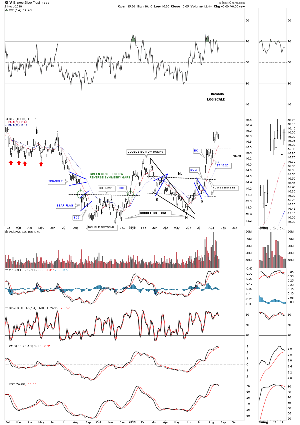
This next chart for SLV is a slightly longer term daily chart which shows the fall 2018 double bottom with the late May of this years low which has created a bigger double bottom. Note the double bottom hump that came into play around the 15.20 area which initially found resistance when the price action rallied up to the previous multi 2018 lows as shown by the red arrows. Once the 2018 lows were broken to the downside that double bottom trendline would then reverse its role to resistance just like we saw at the double bottom hump. That’s classic Chartology.
Once this years H&S bottom was confirmed it strongly suggested that the double bottom hump at 15.20 would give way. As you can see the initial rally out of the H&S bottom slammed into the black dashed double bottom trendline and had a small selloff. That is what you would expect on the first hit. From a psychological perspective everyone that bought SLV above the double bottom hump were underwater at that point so those that wanted to get out had their shot. I have to say I’m a bit surprised that it only took one hit and a backtest for SLV to breakout through such a powerful resistance line. We now have a strong line in the sand for SLV, above the double bottom trendline at 15.20 is bullish and below is bearish.
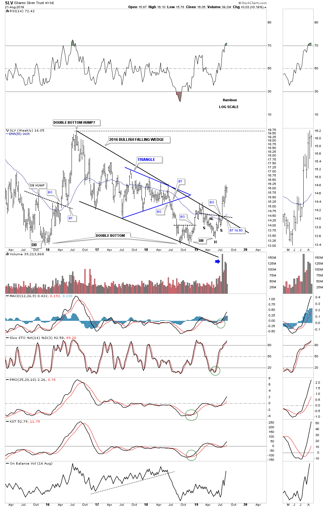
Now lets work our way further back in time and look at a 4 1/2 year weekly chart for SLV. As you already know the dominate chart pattern for the PM complex is the 2016 bullish falling wedge which is showing up on most of the PM stock indexes and most of the individual stocks. SLV is no different from the others just a bit slower in the breaking out process. Here you can see how the H&S bottom formed just below the top rail of the 2016 falling wedge which again strongly suggested the breakout would finally take place. Again, if you didn’t buy the breakout above the neckline and the top rail of the 2016 bullish falling wedge you didn’t get positioned as there wasn’t a backtest.
The other important feature on this weekly chart is the massive three year double bottom. The left side of the three year double bottom was actually a small double bottom. The decline from the August 2016 high formed the bullish falling wedge which finished up with a small double bottom, late last year which is part of a bigger double bottom with the head of the H&S reversal pattern being the second bottom. Note the strong volume that took place on the simultaneous breakout of the H&S neckline and the top rail of the 2016 bullish falling wedge.
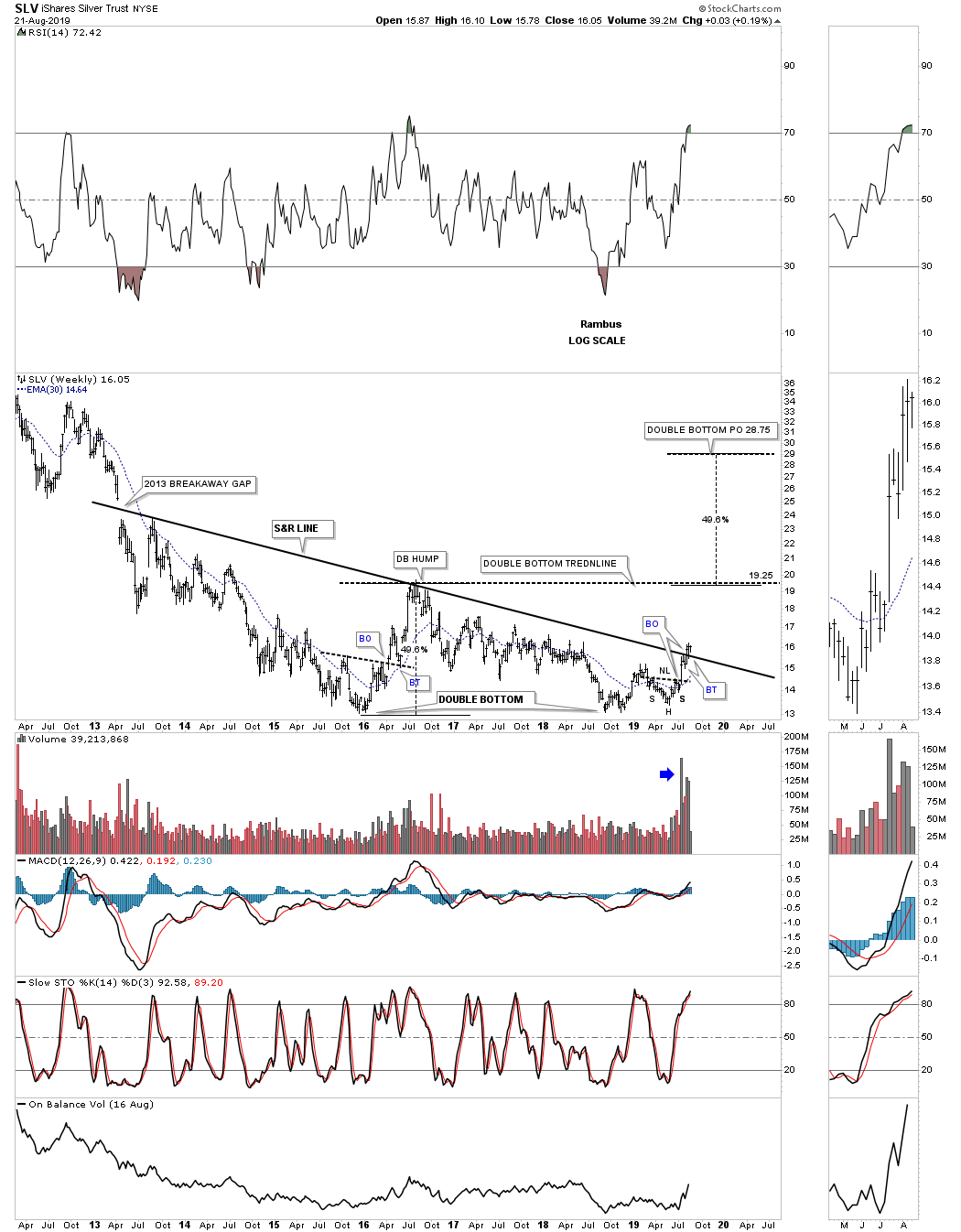
This next long term weekly chart for SLV puts the three year double bottom in perspective. The double bottom hump comes into play around the 19.75 area. The price objective for the 3 year double H&S bottom would be up to the 28.75 area. I would expect we could see a small consolidation pattern form just below the double bottom trendline around the 19.25 area which would give SLV the energy it needs to reach the double bottom price objective.
The 2013 S&R line is the same line that is found on gold’s 2013 H&S bottom neckline. When drawing a trendline, in this case the 2013 S&R line, I always look for a minor low, minor high, or a gap on the left side of the chart in which to set the trendline. This 2013 S&R line actually starts at the breakaway gap that really put the bear market under pressure. If one didn’t heed the warning of that breakaway gap it has been a slow and painful ride to the bear market bottom.
This chart also shows you why I took my third position in USLV this week because of the breakout above the S&R line. Again we have a very clear line in the sand with the S&R line.
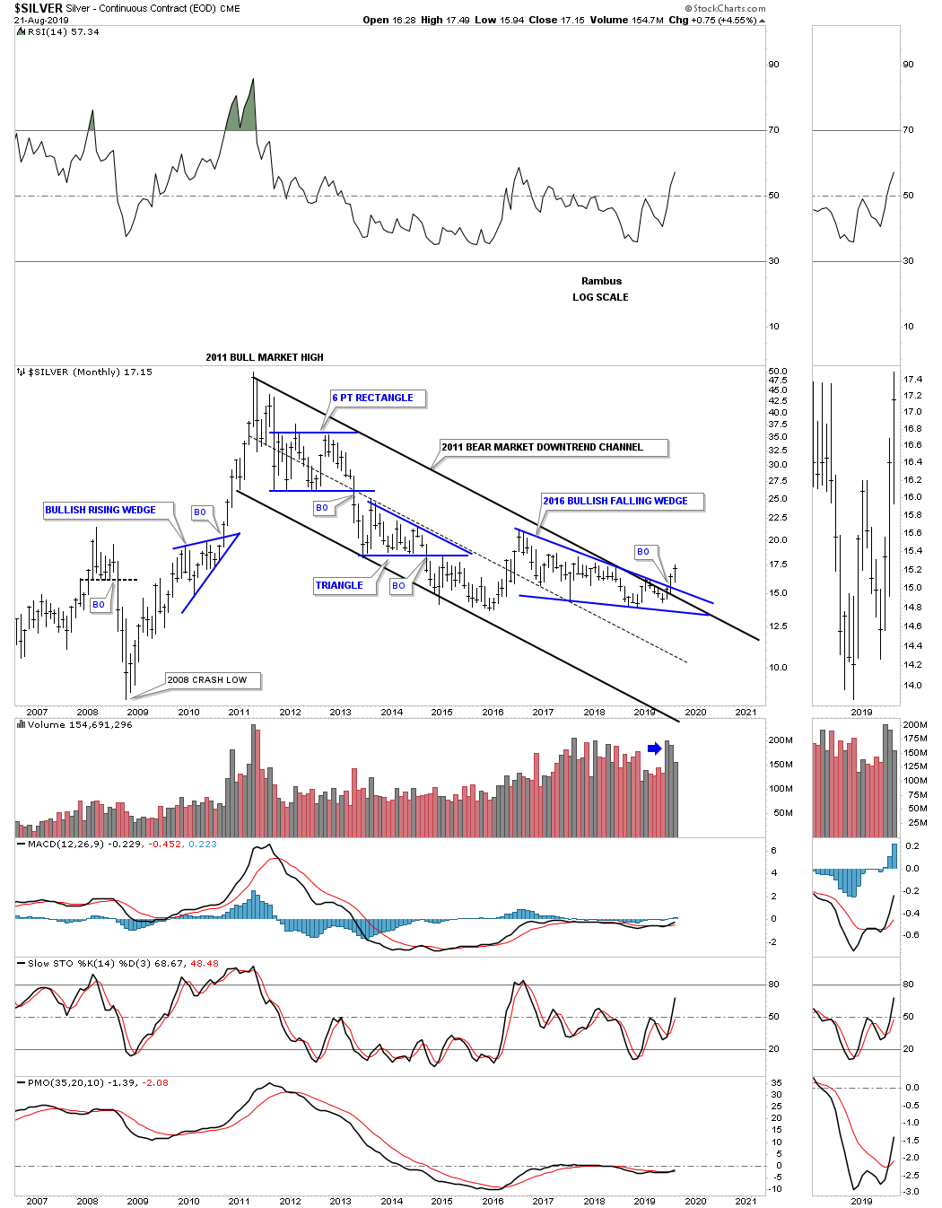
This next chart is a long term monthly chart for Silver which shows its 2011 bear market downtrend channel. Unlike gold and the PM stock indexes that have broken out above the top rail of their 2011 downtrend channel Silver is just now showing its breakout move on a nice increase in volume.
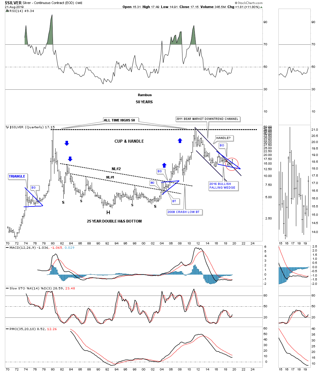
This last chart for tonight is one that I hold near and dear to my heart. This is the very first chart I ever posted publicly back in the old days at, Gold Eagle. Silver was just in the process of breaking out above neckline #1. Back then no one was looking at charts that were 40 or 50 years old. For me the symmetry was just to important to ignore, how silver came down was how it was going to go up. For those that don’t believe in big patterns leading to big moves I would like them to explain away the 25 year double H&S bottom.
Note the perfect breakout and backtest to neckline #1 before silver went on to breakout above neckline #2. I don’t know how many remember the 2008 crash in the PM complex but silver found support on the backtest to neckline #2 which led to the nearly vertical move to fifty. With the 2011 bear market downtrend channel now being broken to the upside is that downtrend channel going to be the handle of a massive cup and handle formation? As they say, we’ll know in the fullness of time. All the best…Rambus
About the author